A long time ago in one of his videos, the pen reviewer SBREBrown said that there are people in it for the pens, people in it for the ink, and people who go nuts over all of it, or something to that effect. I tend to fall into the former camp–if I were cursed to only have one ink in my possession, I would shrug, stock-up on Aurora Black, and be done with it.
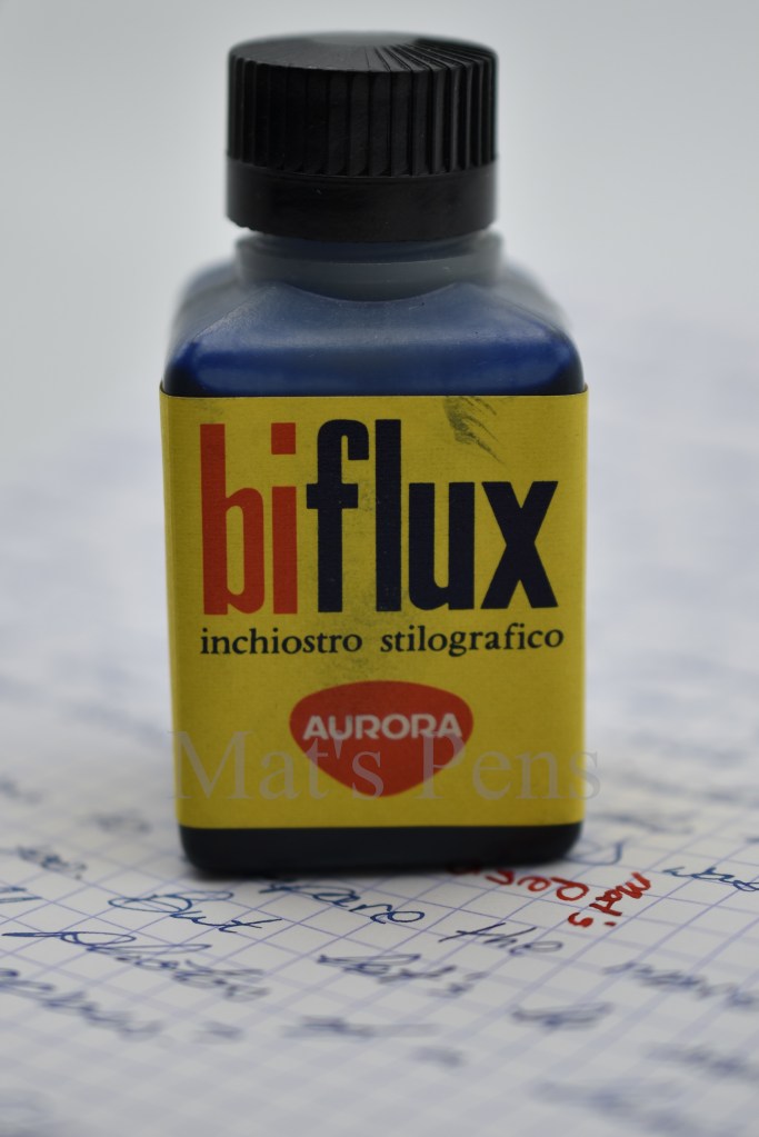
However, I also have an irrational love of all things Aurora, so when I saw a vintage bottle of Aurora Biflux ink, I knew I was doing my first ink review.
I’ve had plenty of vintage Aurora cartridges. Unfortunately, cartridges dry-up, so there’s really nothing to sample unless I wanted to puncture them and try to reconstitute them, which would probably be more of a mess than it’s worth. Bottled ink is less susceptible to this effect, and this particular bottle isn’t sealed, so I figured it would be fun to take a few milliliters and check it out.
Much like modern Aurora ink bottles, this ink bottle has a plastic stopper under the cap, which probably helped it stay intact.
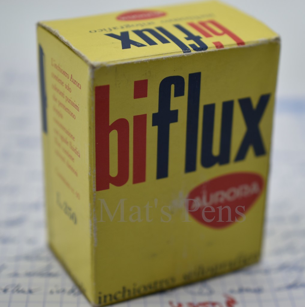
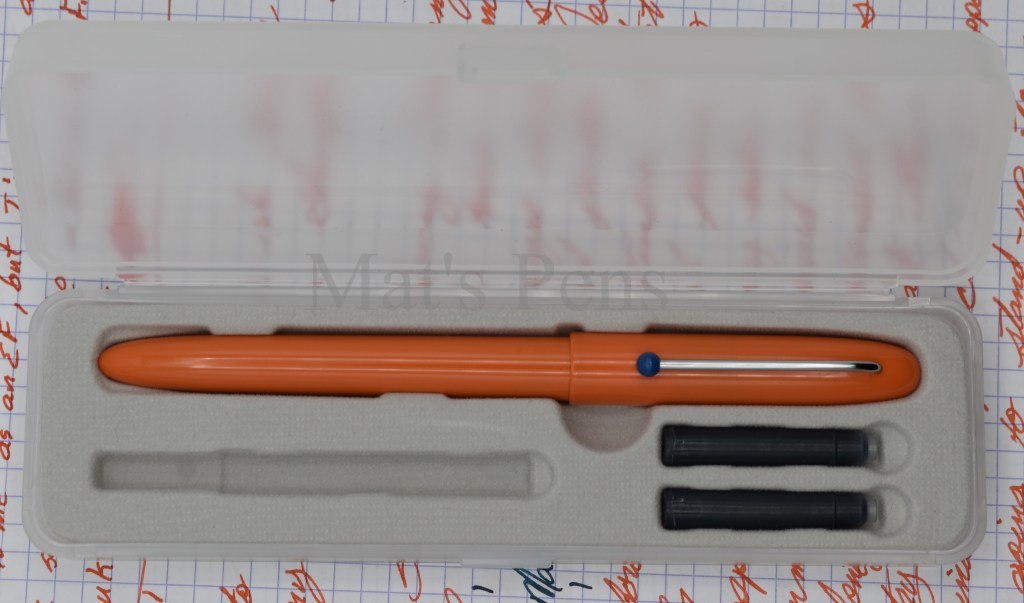
I really wanted to compare vintage Biflux black to the much more popular Aurora Black, but this bottle is Bleu Reale, or Royal Blue. I’m not sure a bunch of pictures of black ink would be totally compelling, but maybe I’ll stumble on a bottle of Biflux Black some day.
I wasn’t really sure what to expect with this ink, honestly, because there isn’t any information on it–at least that I can find in English. Was this ink some legendarily cool ink, like Parker Penman Sapphire?
Spoiler: it’s not. It’s just a solid, work horse ink. Interestingly, it’s not anywhere close to what we’d call a royal blue today–I’d definitely call it blue-black.
A few more observations, in no specific order:
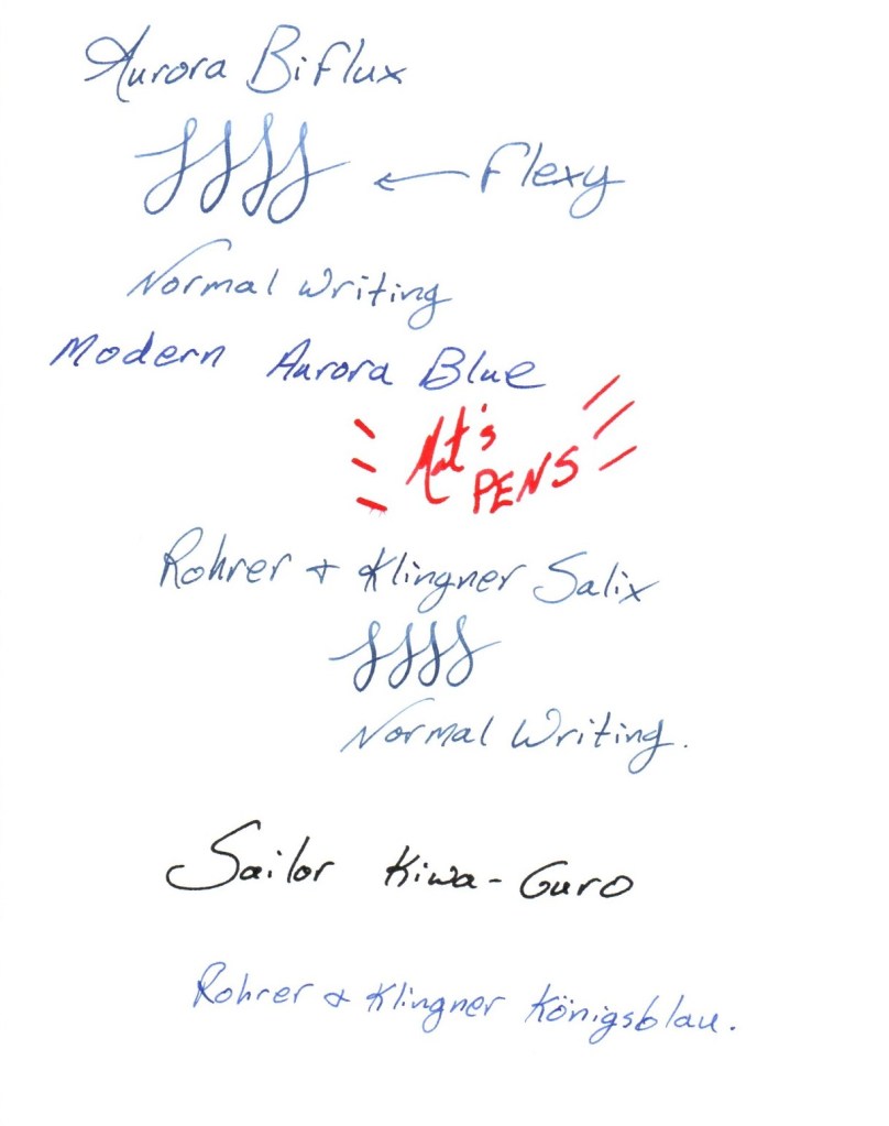
It’s a pretty wet writing ink. The pen I used for the review–my Aurora 888–is not exactly a dry pen, but the two go together very, very well. It’s almost like they were made for each other (they were. Sort of. The 888 never filled via converter. So assuming the cartridges and bottle ink were the same, then. . .)
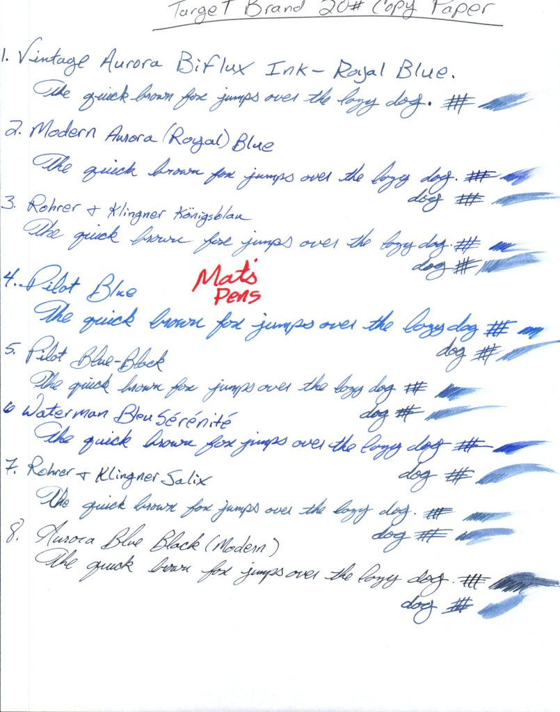
This ink is incredibly well behaved. It works on basically every paper I’ve used it on, and functioned fine on the test papers–Hammermill paper notwithstanding.
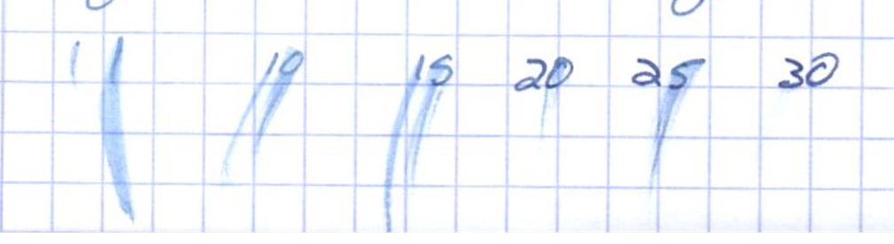
Shown on regular copy paper from Target. Very little feathering (from any of the inks.) So little bleed through was present on the reverse I didn’t bother showing it–it’s only present where there are periods or heavy marks. This is very decent paper, or at least this ream is, but most blue inks are also very well behaved, Biflux Blue included.Shown on Hammermill 20# copy paper–some of the worst copy paper I’ve encountered for fountain pens. Even my most feather-resistant inks are no match for this crappy stuff. Horrid spread and feathering. This is more of a property of the paper. This ink won’t work on the crappiest of the crappy paper.Reverse of the above, Hammermill 20#.A copy paper control group, I guess? Paper is HP 32# Premium–about the best copy paper one can commonly buy. No feathering, to speak of, except a bit on that Lamy Broad, in red, which isn’t being tested anyways. No bleed through.
The dry time is long, around 30 seconds. Perhaps this is a side effect of its wetness. It’s somewhat hard to judge these qualities because the ink may have changed a bit in the last 60+ years it’s been hanging out.
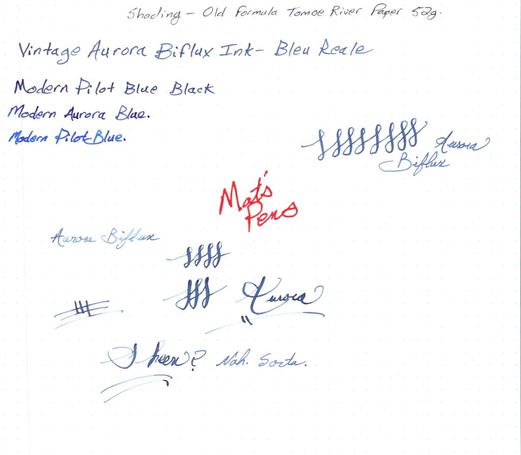
Shading is pretty standard. There isn’t much sheen to be had. I even sacrificed one of my last remaining sheets of the original formula, pre-shutdown Tomoe River paper and brought-out a super-secret Aurora friend that I can’t reveal yet–a combo that would certainly expose any neat sheening–and the results weren’t anything more interesting than a standard ink like Pilot Blue Black. There’s some there, but it’s not an ink those sheen-loving folks are going to go bananas over.
Such things never come through on scans quite as well as they would in real life, but the ink is about as sheeny as a regular blue-black ink from any modern maker, like Pilot.Hard to see, but there’s a fair amount of red sheen typical of these types of ink.
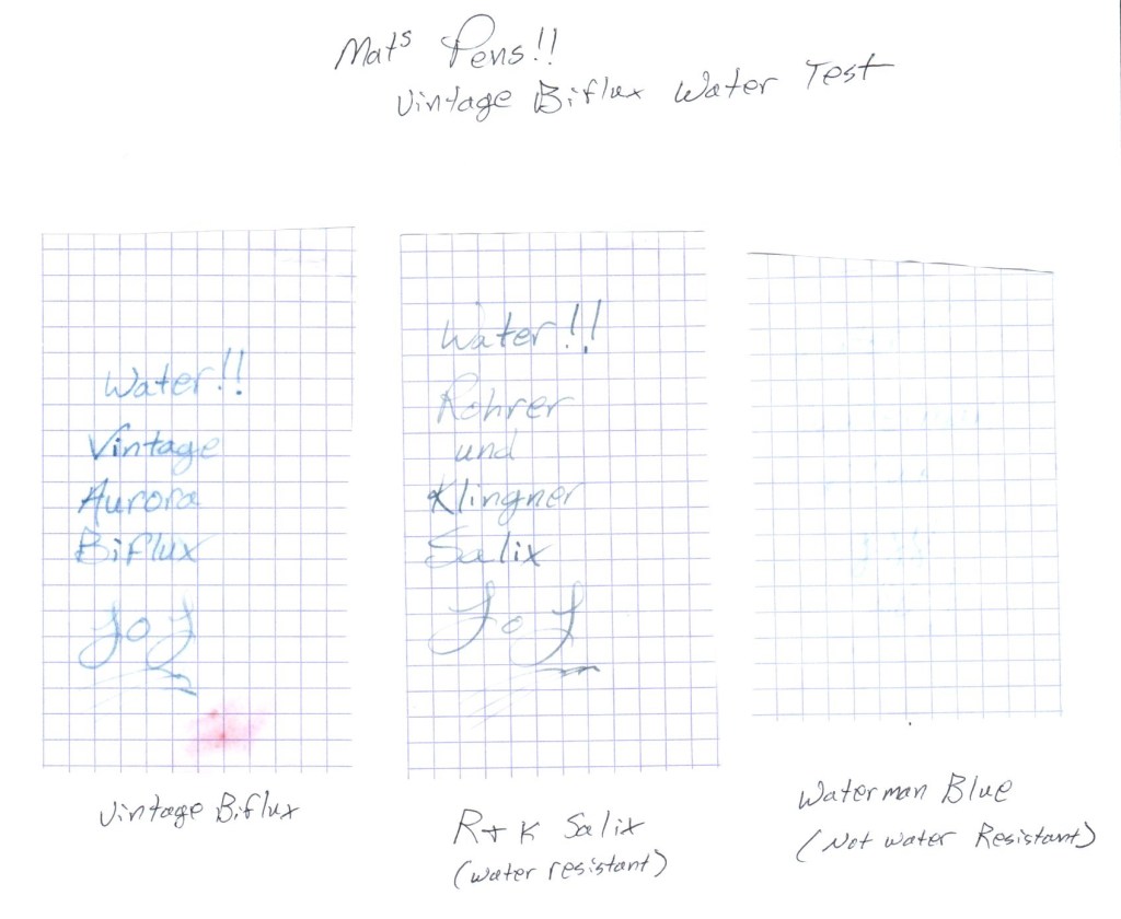
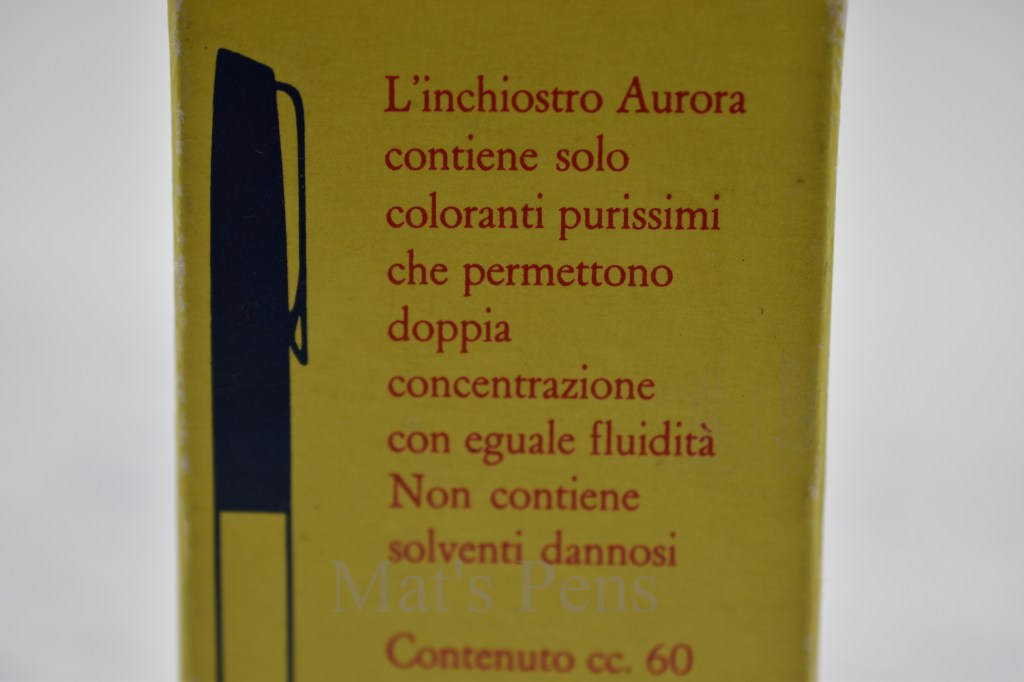
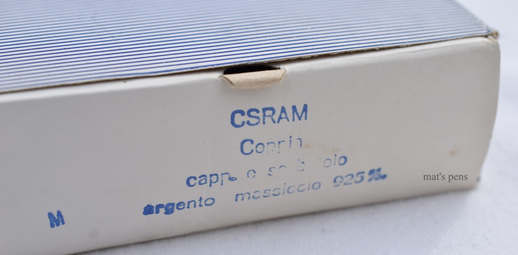
Water resistance is very good, at least as good as Rohrer and Klingner Salix–an iron gall ink. It really wouldn’t surprise me if this vintage Aurora ink was an iron gall ink, based on how it performed on paper, but I have no way of testing it. Interestingly, the box states that the ink only contains dyes and no harmful solvents–at least according to Google translate–so who knows.
No sure where the red smudge came from, but it’s there. The vintage Biflux holds up to water just fine.Pure dyes, no harmful solvents, etc. I don’t speak Italian. The cap style of the illustrated pen on the left, though, is typical of an Aurora 88P, which was produced from approximately 1958 until approximately 1963. This ink is around 60 years old.
Clean-up was fine. No issues. It didn’t dissolve my vintage pens. I didn’t use it in a modern a pen, but I can’t imagine it would hurt those, either.
So there we have it. If I were forced to only use vintage Aurora Biflux Bleu Reale, I think I would get by. I’m not going to make it a habit of using this ink, I’m afraid–it’s too cool having it in my collection–but it was a very solid ink in its time and just as reliable today, if a bit on the utilitarian side. Anyone looking for a similar ink could check out Pilot Blue Black–it’s way, way cheaper, easier to find, and overall very similar in appearance and performance.
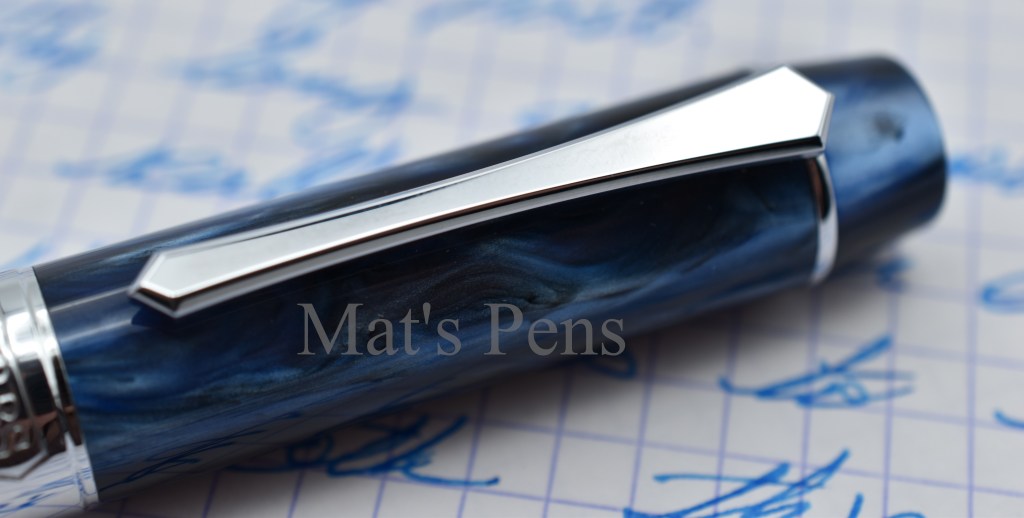
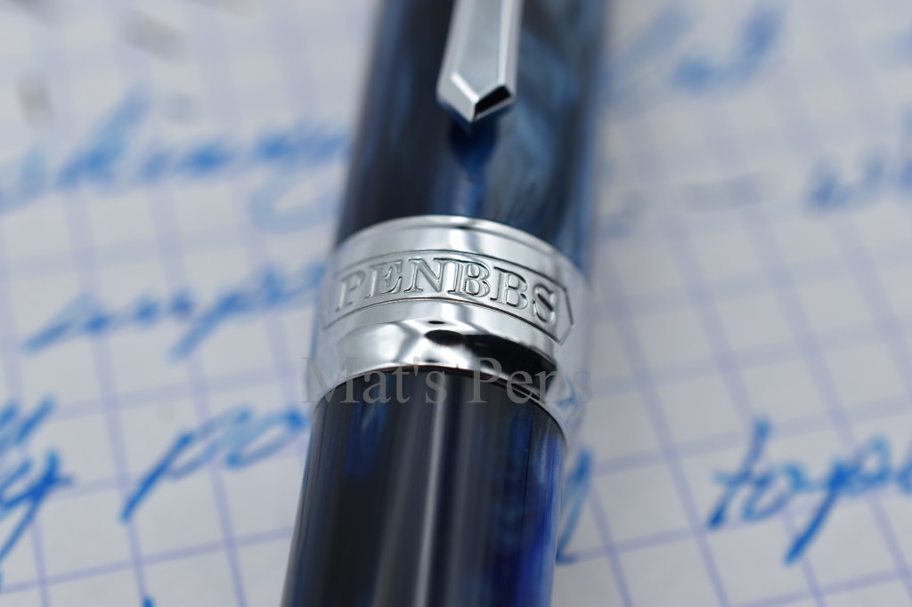
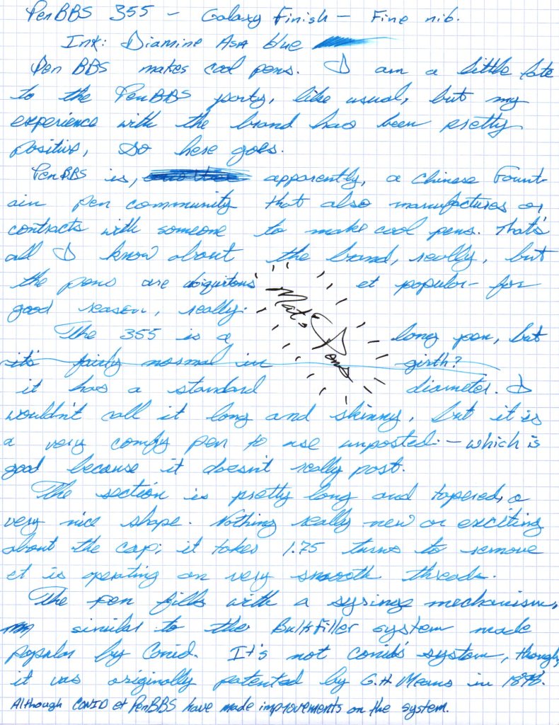
PenBBS is, apparently, a Chinese fountain pen community that also manufactures or contracts with someone to manufacture fountain pens. The brand is ubiquitous and has grown in popularity over the past couple of years, and for good reason.
The 355 is a very interesting pen. It is quite long but has a fairly standard diameter, so it feels substantial. The section itself is also long and tapered; the pen is very comfortable to hold and use. The section is easily removed, making cleaning the pen a trivial task.
The cap is a simple, threaded design that takes 1.75 turns to remove. It does post, but the pen becomes long and unwieldy, so I don’t think most users will routinely post this pen.
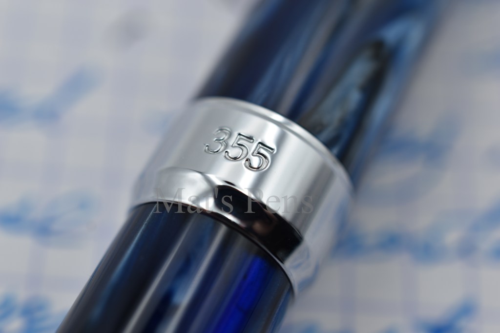
I like the shape of the clip. It is functional and secure.The cap features a simple band with the brand engraved in it.Reverse of the cap band.The finial is the same material as the rest of the pen.
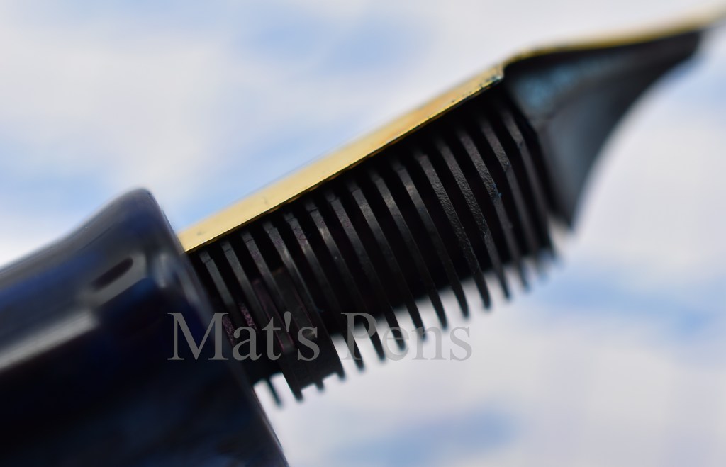
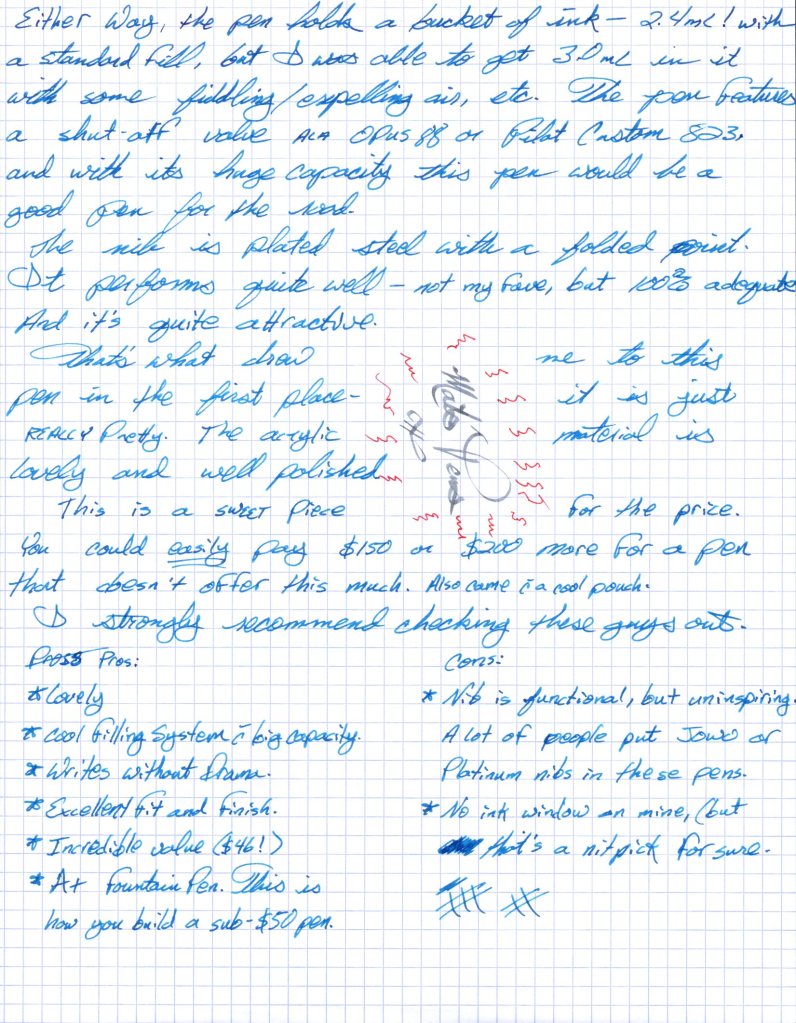
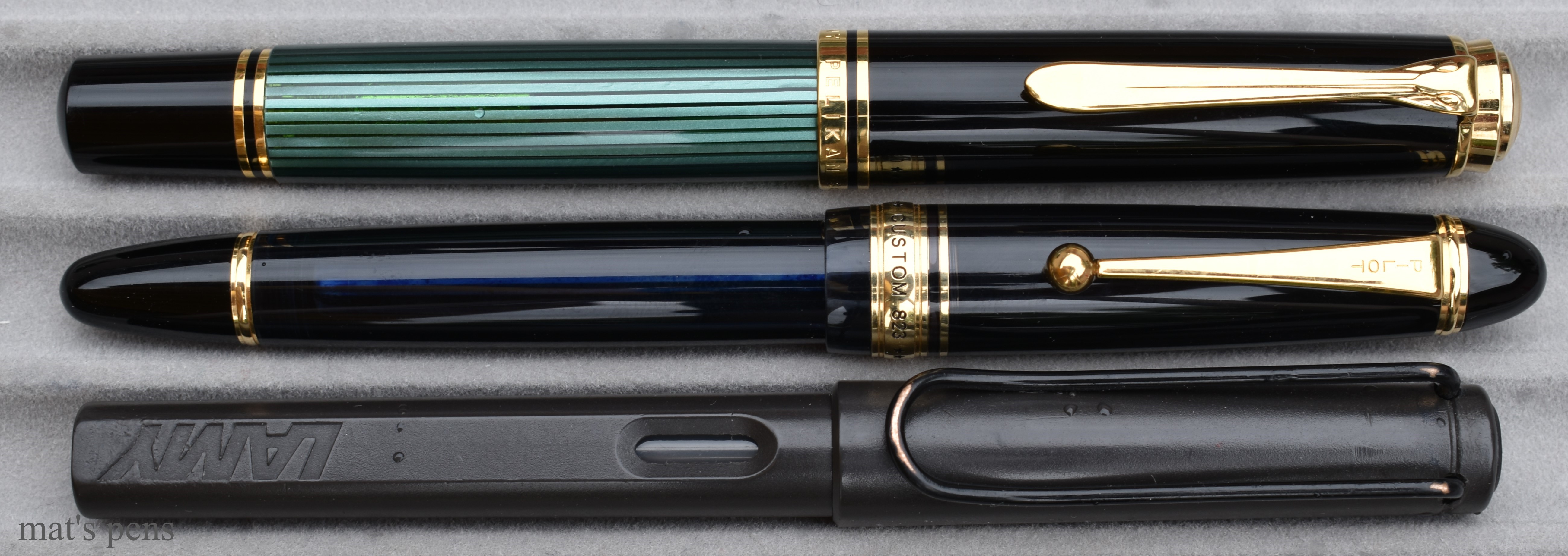
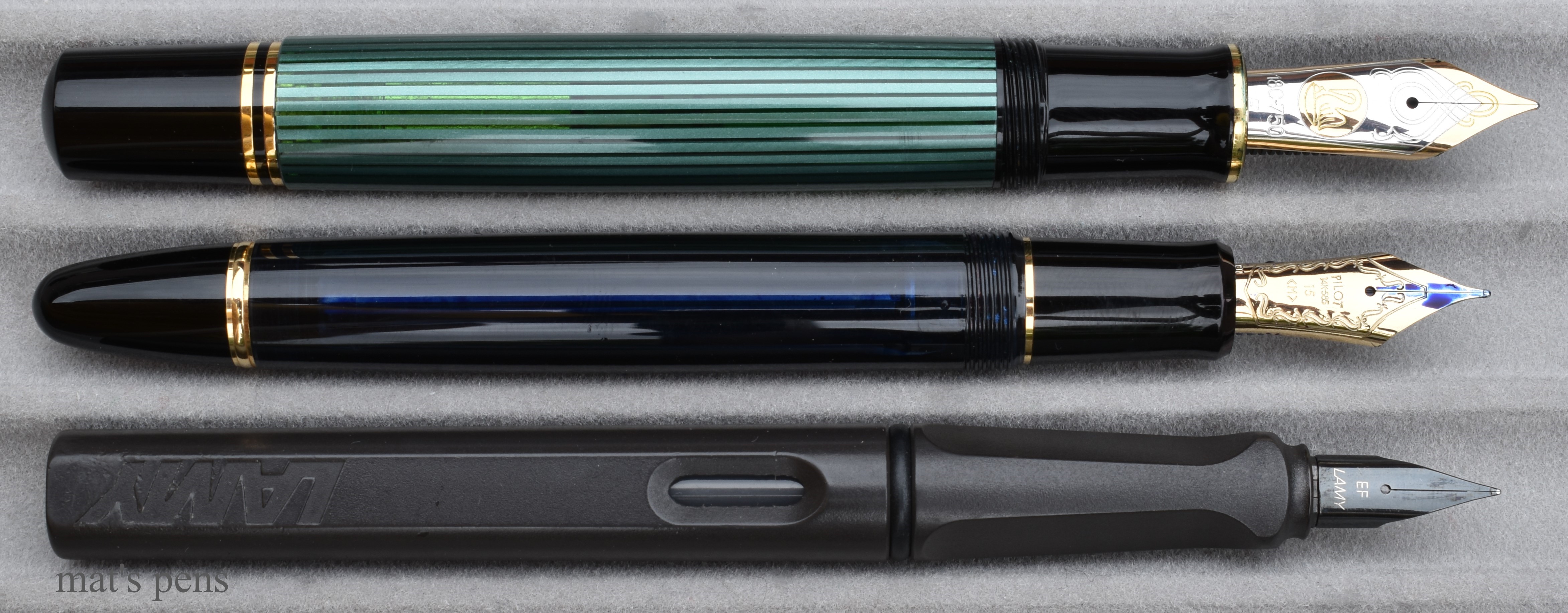
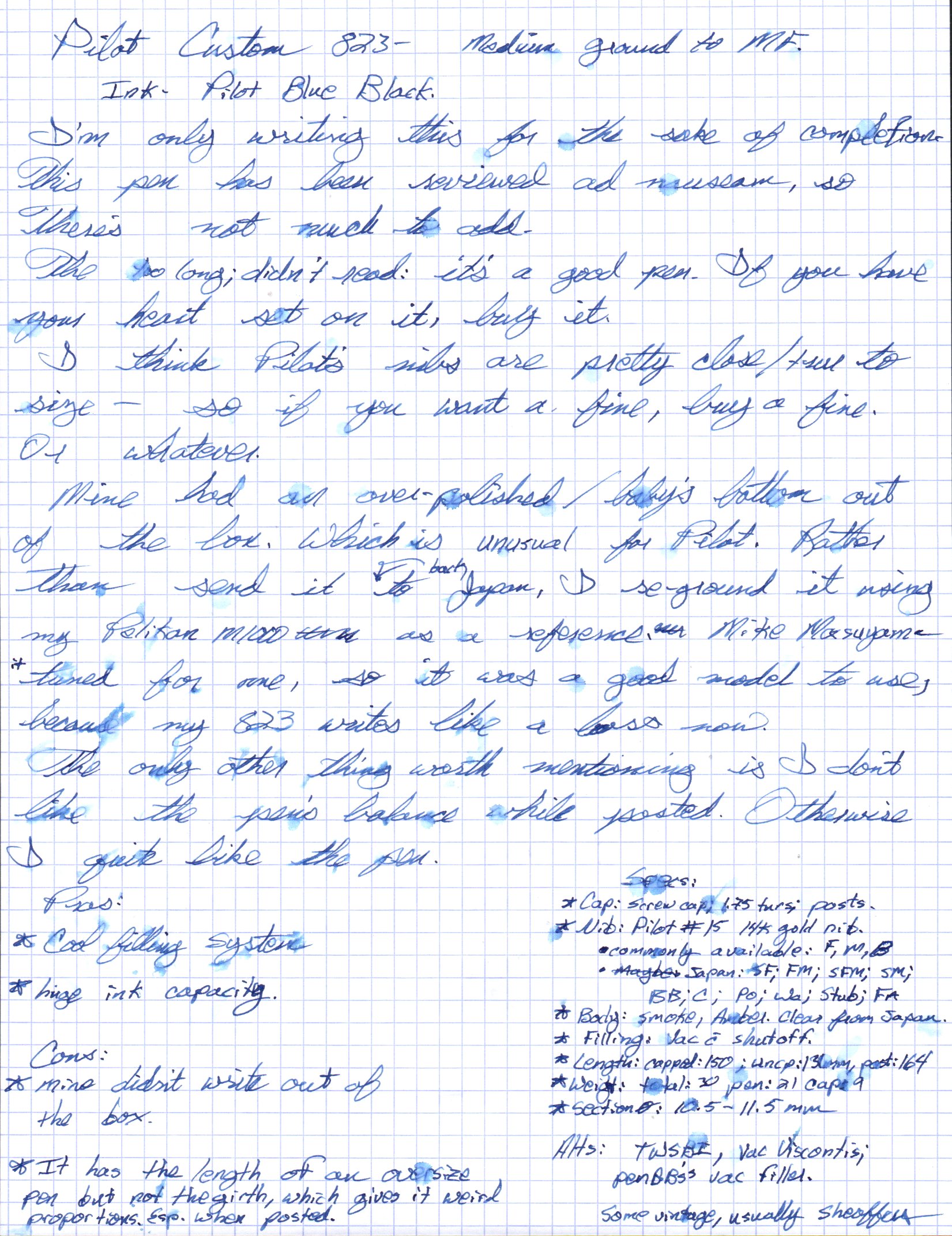
The 355 is the brand’s example of a syringe filler, not unlike Conid’s patented Bulkfiller system. It features an ink shutoff valve that, when completely closed, prevents ink from reaching the nib and feed. I have a Pilot Custom 823 that has a similar feature, and I find it very useful for traveling because it is easy insurance against leaks caused by pressure or temperature changes. The pen holds a bucket of ink–2.4mL for a typical fill or a maximum of 3mL if the pen is inverted, the residual air is expelled, and the pen is filled again. I don’t really bother with getting a full ink fill because I invariably flush pens before they’re empty, but a lot of writers love huge ink capacities and only use one ink. This pen would be a good choice for those users, or someone who flies a lot and doesn’t want to carry refills.
There’s been some discussion online about weather PenBBS ripped-off, copied, cloned, or etc. Conid’s system, but the reality is that the original concept of a telescoping/reciprocating syringe-filling system was originally patented by G.H. Means in 1898 and both Conid and PenBBS have made their own unique improvements to the filling system, so it’s not really relevant at this point.
The idea has been around for awhile. Curiously, Mr. Means’s design also included a button to make his pen write wetter or drier.
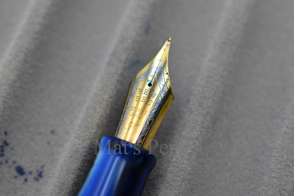
The pen features a very attractive two-toned nib, and it writes fairly well. It’s not my favorite nib ever, but it is adequate for the price of this pen. It is folded steel–the writing point is made by folding the nib onto itself and polishing that rather than attaching a separate pellet of tipping material and shaping that into a point. This is an old technique for making cheaper nibs, but the nibs’ profiles end up being squarish with smaller “sweet spots” than conventional nibs. Technicalities aside, the pen wrote just fine out of the box with no drama.
In its defense, the nib is very pretty and writes well enough, for what it is.Closeup of the nib’s profile. The square edges are well polished on this pen, but it has a small sweet spot, so the pen is not forgiving as far as rotation is concerned.The plastic feed is simple and effective.
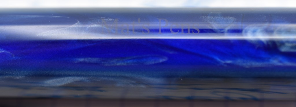
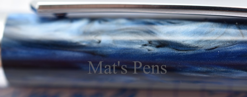
What really attracted me to this pen was the finish–mine is the galaxy acrylic. The pen is available in a number of finishes, but potential buyers might have to search around a bit to find the one they want.
Closeup of the material.Same section of the pen as above, except rotated.Same section of the pen, but rotated again. There is a lot of depth and character in this material, and the pen is very attractive for it.
PenBBS pens, including the 355, are often used as platforms for JoWo, Aurora, Platinum, Sailor, or other nibs by enterprising tinkerers, likely because of their low cost, attractive finishes, enhanced cool factor, and bland nibs. I could see this pen being really cool with a Platinum 3776 nib on it, quite frankly.
Another shot of the cap.
For the price, this is a sweet deal. It’s a pen by fountain pen people, for fountain pen people. The fit and finish are fantastic, the pen is attractive and feels good in the hand, and it writes correctly, even if the nib isn’t really inspiring. Other companies would happily charge $150 or $200 more for the same thing. I strongly recommend checking out this pen.
Pros:
Very attractive material.
No nib drama. It just wrote, and continues to write.
Fit and finish are spot-on.
Incredible value. I paid $46 shipped!
A+ fountain pen. This is how you build a sub-$50 pen.
Cons:
The nib is functional and practical, but uninspiring–stiff, small sweet spot, and too fat to really be a fine. It’s not a bad nib per se, it’s just not my favorite.
This is more of a personal note than a true con: while I think the idea of this pen’s filling system is great, in practice unscrewing the piston rod, engaging the plunger, and otherwise actually using the pen is incredibly fiddly compared to a piston or vacuum filler or even an eyedropper pen with an ink shutoff valve, like an Opus 88. This is compounded slightly by my pen not being a demonstrator, so it’s impossible to see what’s going on in the pen. Again, not really a true con, and once the pen has ink in it it’s basically irrelevant.
While they are not presently in production, Conid Bulkfillers are, apparently, really cool. I never personally bothered because I hold Bock nibs in total contempt and Conids are exorbitant, but that’s just me.
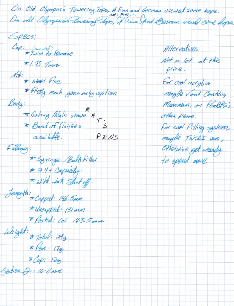
Specs:
Cap:
Threaded.
1.75 turns to remove.
Nib:
Folded steel nib.
Only available in Fine, it seems, and it’s not especially fine.
Body:
Acrylic, shown in the galaxy finish.
There are seemingly dozens of finishes available.
Filling system:
PenBBS doesn’t appear to have a name for it and I’m pretty sure Bulkfiller is trademarked by Conid, so I’m calling it a “reciprocating syringe filler.”
Ink capacity is around 2.5mL.
Includes an ink shutoff valve feature.
Length:
Capped: 146.5mm
Uncapped: 131mm
Posted: a hilariously long 173.5mm
Weight:
Total: 29g
Pen: 17g
Cap: 12g
Section diameter:
10-11mm
Shown with a Lamy Safari.The pen is not comfortable when posted.Ink is the lovely Diamine Asa Blue.
I didn’t want to write this review. I feel like it’s going to be one of the few dissenting YOL reviews out there. But the community needs to hear about my experience.
I actually love Yard-O-Led, in principle. I gushed over them in my post on the YOL Viceroy Grand–which is truly a remarkable work of art.
But I also outlined some of the issues I’ve noticed with the company in my post on the YOL Standard.
For context, I recommend reading both of those reviews before continuing.
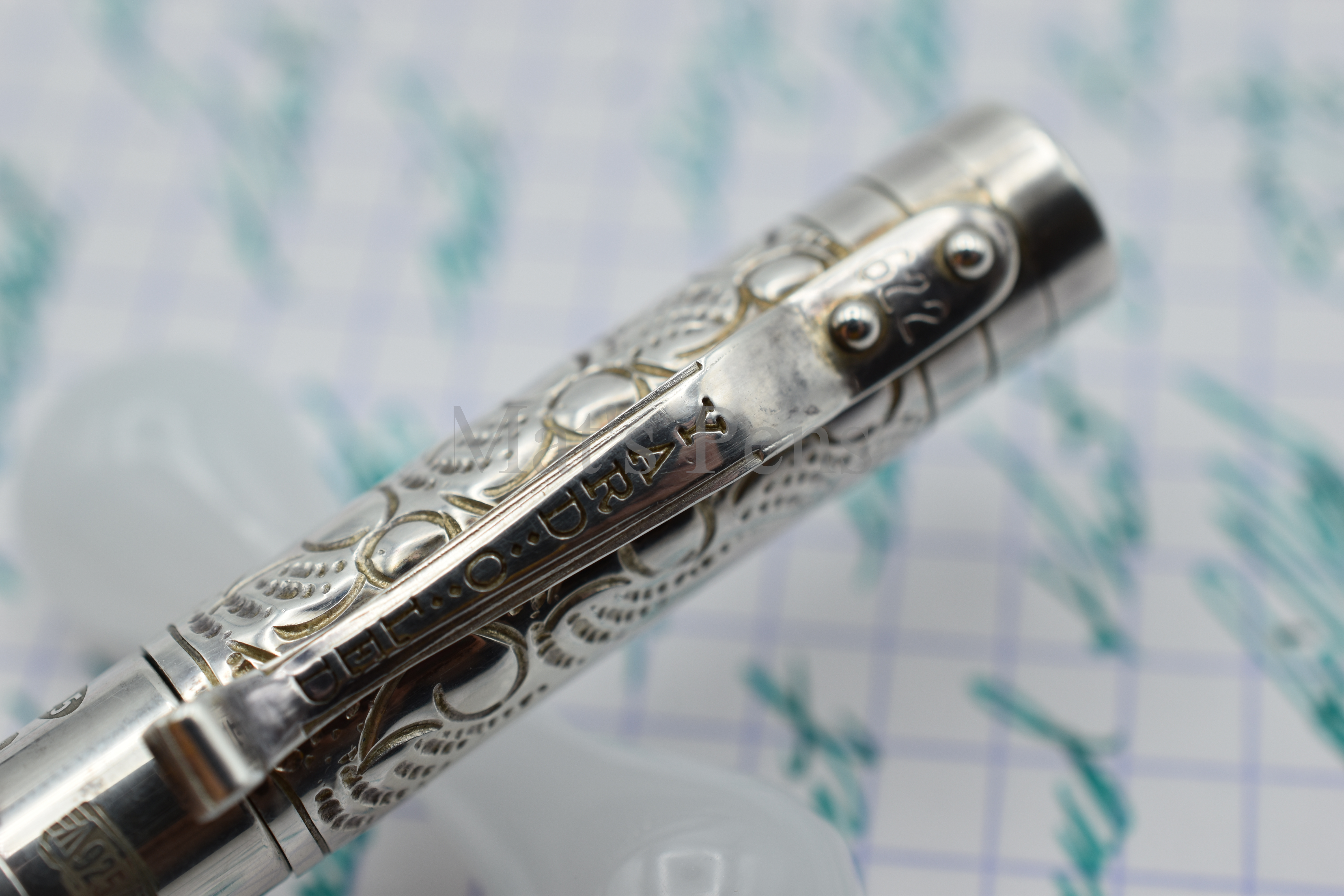
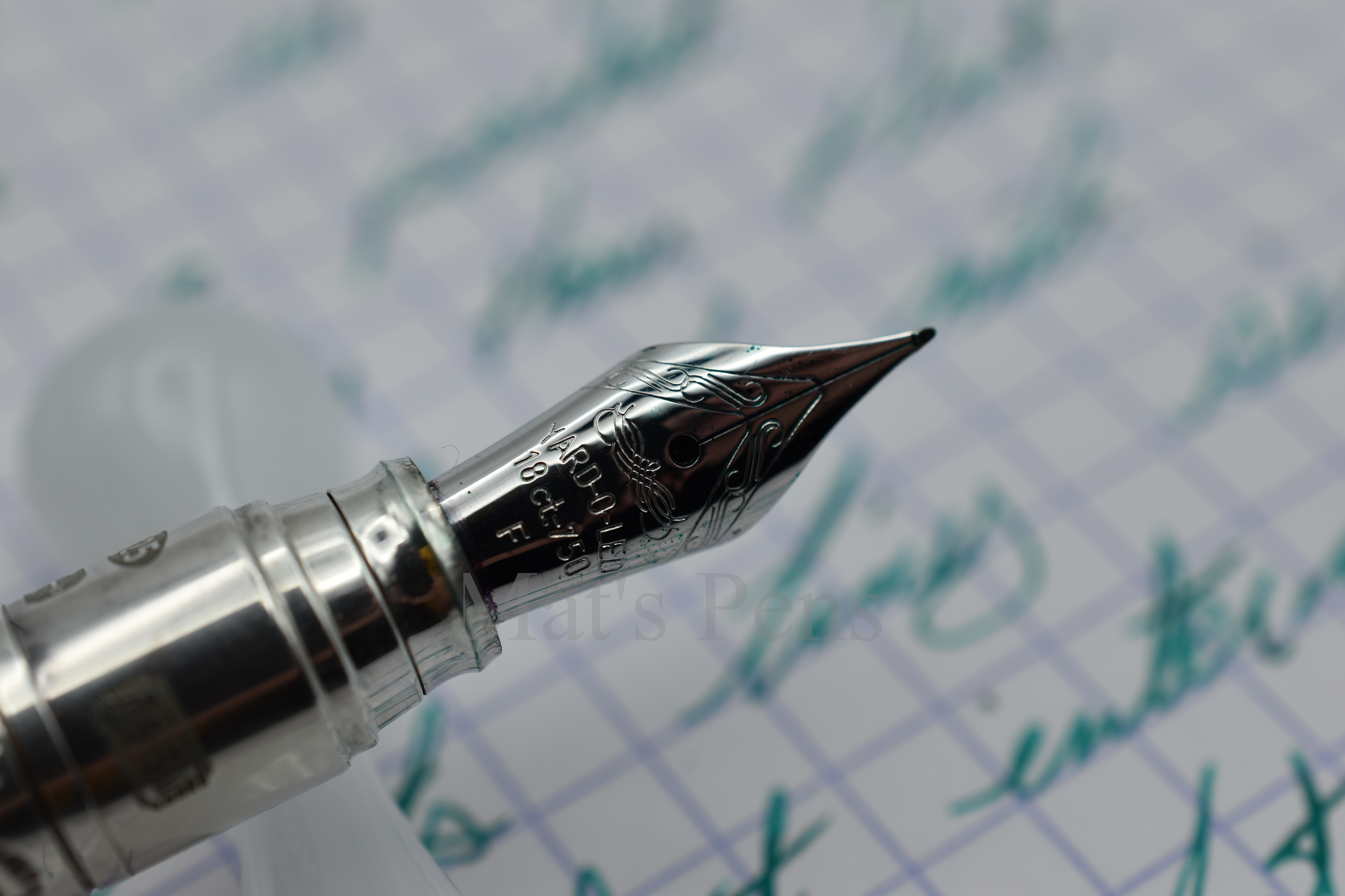
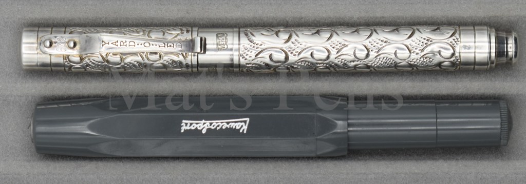
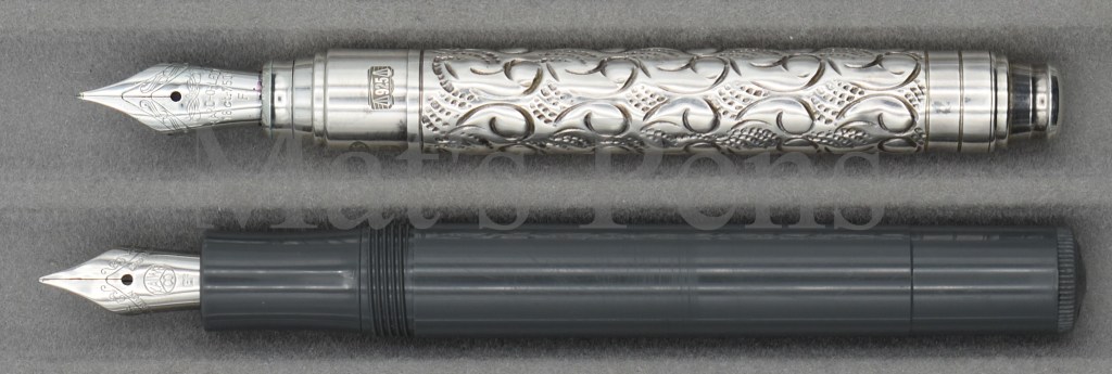
First, the good: this petite pen is beautiful. Each pen is individually made either on very old machining tools or chased by hand by silversmiths. Because of this, one can see the different styles used by the individual silversmiths–for instance, it’s very obvious that my older Viceroy Grand was made by a different person than the Pocket, even though they are the same pattern.
Detail of the Viceroy Pocket’s finish.Pocket on the left, Grand on the right. They’re both the same finish, but made by different smiths so they have different character–the patterns and the depth of the strikes are much different. Both are very pretty.
The Pocket is awesome. Delicate. Petite. Painstakingly made with care by artisans.
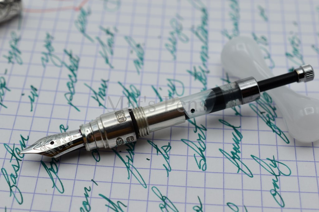
The tiny size necessitates writing with the cap posted. The pen only fills via short international cartridges officially, but I found that the pen can use a Kaweco slide piston converter if the converter is only filled to about 70-80% capacity. The barrel of the pen cannot accommodate the piston rod when it is fully extended and filled, and reassembling the pen creates a mess when the barrel compresses the tiny piston. Is this hassle worth the 0.4mL ink capacity? That’s up to the user. If it were my one and only pen, I’d just use cartridges.
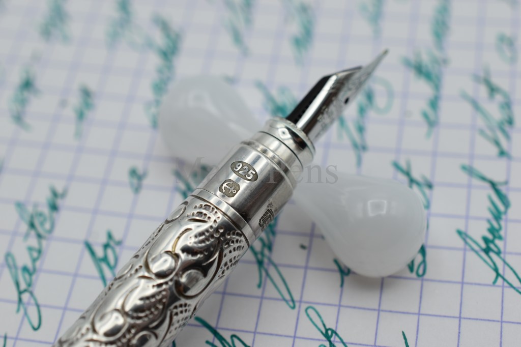
The finial is polished silver.
Sterling silver hallmark.
UK Assayer’s Mark
Yard-O-Led maker’s mark and S date code (2017).
Sterling silver hallmark (925) and Birmingham Assay Office mark (anchor).
The end of the pen is shaped much like the section so the pen can post well.The pen will fill with the Kaweco mini piston converter, not the squeeze type. It is shown filled as full as it can get without squirting ink all over when reassembled.
This is where my YOL Viceroy Pocket love affair stops. It’s all downhill from here.
The cap is not secure. The pen–like all of YOL’s fountain pens–uses a simple plastic inner cap that engages with a lip on the pen and is subsequently snaps into place. But for whatever reason on my Pocket, the inner cap does not engage very well; in fact, it is downright insecure. Any lateral pressure on the cap, whether posted or in the pocket, causes the cap to dislodge and pop off. This doesn’t sound like a huge deal, but think about all of the times one could conceivably place pressure across the pen when it’s in a shirt pocket–crossing your arms, leaning against a surface, or bumping into something can cause the cap to come lose. Now you’ve got a cap clipped to your shirt and a pen floating around your pocket. Forget about having it rattling around a purse or bag, unless you can find a suitably rigid pouch to keep the pen in. This is obviously a very bad quality for a pocket pen.
Detail of cap and clip. Each pen is serialized, also shown on the clip. Not shown is the exceptionally weak inner cap that does not keep this pen closed.
I have great disdain for Bock nibs. Every nib that I’ve tried that was originally made by Bock, whether on a $20 Kaweco or on this very expensive Viceroy has had some issue and required some level of correction to make it write correctly. The nib on this pen was a disaster out of the box. It came with a very blobby, wet, medium nib that was so unbelievably over-polished that it barely wrote. That nib is now on my Viceroy Standard and had to be corrected by a nibmeister. The nib that is currently on this pen was also so over-polished that it did not function out of the box. Dan Smith ground this nib into an extra fine for me when he was still doing outside work, and now the nib is okay. Dan does magnificent work and the grind is perfect, but I still don’t really like how it writes. It feels like the nib has too much flex but in a weird way, like the tines flex too much radially creating weird, needle-like feedback. It’s an 18k gold nib and it has to be very thin to get this level of softness, which makes the nib feel unpleasantly fragile to me. Flexing this nib would certainly spring it or outright destroy it. There is a reason why the best vintage and modern flex nibs are 14k gold. To counter-act this sponginess, my pen has to be used with a very delicate touch, which might be okay for some users but I don’t like that quality in a pocket pen that is, presumably, intended for hurried jotting. I’ve half-considered finding a generic steel #5 Bock nib and trying that in this pen to see if I like it more.
It’s a lovely nib, and although it was pretty crappy originally it’s since been fixed. It’s a bit too spongy for my tastes, unfortunately.
This pen currently retails for well over $1000. I didn’t pay nearly as much for it when I got mine, but even for what I paid for it it should have wrote well.
edit: Looks like Fahrney’s is carrying some YOL pens again for a much fairer price–no affiliation, and they don’t seem to carry the Pocket model. That’s probably where USA customers will need to go for a YOL pen.
YOL has, historically, been noted for its good customer service but when I emailed them with a question I received a canned response telling me to send the pen back to Birmingham. That’s a solid “meh” from me on the customer service front. Plus they’re not accepting repairs because of the pandemic–I don’t hold that against them for obvious reasons, but it’s something to consider if one is currently trying to decide on a YOL instrument right now. You don’t want to get stuck with an unrepairable dumpster fire of a pen that cost you a whole stack, now do you?
So, there we have it. I love YOL as a company, I really do. I love the company’s story, I love the art they are producing. But I am not a silver rod collector, I am a pen collector, and I can buy a hell of a lot of pen for $1000. Maybe that’s harsh, but I’d point-out that silver still isn’t that expensive as far as precious metals go (the spot price is under $30 per ounce [28 grams], as of this writing.) Compare this price to, say, Nakaya pens that are also produced entirely by hand and undergo lacquering processes that take months and can be found for well under $1000. And their pens are basically guaranteed to write.
It breaks my heart to write this, but I’d pass unless you get a good deal or can get it from a retailer with an outstanding return policy and even then I’d only pull the trigger if you really have your heart set on a Yard-O-Led fountain pen.
edit: I was thinking about this and I am pretty sure I bought the YOL Pocket when the Pound/Dollar exchange rate was very favorable. I wanted to be sure I wasn’t ranting about price increases and stuff that had more to do with geopolitical market shenanigans than it did with the company.
So I checked some historical prices via http://www.archive.org (no affiliation.) The Pocket was around £356 ($500ish) when I bought it in 2017. It is retailing, today, for £900. The Pounds:Dollar exchange rate was 1:1.29 back then compared to 1:1.39 as of today. It wasn’t the exchange ratethat sent these products from expensive but obtainable to laughably exorbitant.
Pros:
I mean, just look at it.
In the hand, it is quite comfortable to hold and well balanced. The proportions are very nice. It has all of the trappings of a fantastic pen, but. . .
Cons:
. . .for the price, YOL has alarmingly unacceptable quality assurance. For what I paid for this pen I was pretty disappointed. If I’d paid today’s MSRP I would have been outraged.
Alternatives:
If you are in the market for a pocket pen, get literally any other pocket pen. On the inexpensive side, consider:
Kaweco Sports and Liliputs are bombproof. Their nibs usually need some tinkering but Bock seems to bork cheaper nibs less often, for some reason.
PenBBS 471 is a great pocket pen.
I find the Luoshi 358B a charming pen, and they work well for the price. One can buff the paint off pretty easily if you aren’t into the cigarette look.
Sheaffer Balance Juniors are fantastic pens. I recommend this one if looking for a flexy pocket pen–just make sure you find one with a “Junior” nib as the rest are not flexible at all.
Pilot E95s. Easily one of the best sub-$150 pens out there–possibly in the top 10 of the sub-$300 category–pocket pen or not. At least in my opinion. Really any vintage Japanese pocket pen by Pilot, Sailor, or Platinum could also work. This style of pen is a bit larger than European-style pocket pens, but they follow the same general concept of being small when capped and bigger when uncapped.
High-end pocket pens are somewhat difficult to come by, but for a more premium pocket pen look for:
Aurora Optima Mini.
Montblanc 114 Mozart.
The now-discontinued Pelikan m300.
The now-discontinued Delta Dolce Vita Mini, but watch-out for that Bock nib.
If you are in the market for a Yard-O-Led, I recommend the Viceroy Standard over the Pocket because the cap is far more secure, but even the Viceroy Grand isn’t that high of a premium over the Pocket model. Personally I would have gotten the Viceroy Pocket ballpoint and used Uniball Jetstream D1 refills with it had I known that I’d dislike the fountain pen so much.
Specs:
Cap:
Pop-top.
Posts.
Nib:
*shudders*
Available in Fine and Medium. Maybe Broad, but after a cursory search I couldn’t find any for sale in Broad as of this writing.
Body:
Hand-chased sterling silver.
Shown the Victorian finish, also available in Barleycorn.
Filling System:
Officially Standard international short cartridge only.
Kaweco mini piston converters can be made to work but only hold a tiny bit of ink. Squeeze-type Kaweco converters did not work for me in this pen and created an inky mess.
I am willing to bet that one of these minuscule Templar Ink mini converters would work, too (no affiliation). I’ll update here if I’m ever enterprising enough to buy ridiculously small converters to try in a pen I don’t really care for that much.
Length:
Capped: 110mm
Uncapped: 95mm
Posted: 127mm
Weight:
Total: 28g
Pen: 20g
Cap: 8g
Section Diameter:
10mm
Top to bottom: Pocket, Standard, Grand, capped.Top to bottom: Pocket, Standard, Grand, uncapped. The pen isn’t really big enough to be used like this.Top to bottom: Pocket, Standard, Grand, posted.With Kaweco Sport.With Kaweco Sport.With Kaweco Sport.
Trigger warning: I poke fun at fountain pen enthusiasts in this post, especially Parker fans. A lot.
Last year, Parker announced that they were releasing an updated version of their legendary 51 to much outrage, wailing, and gnashing of teeth by purists.
The problem with re-issuing a legend is it’s only going to be compared to its former self. I brought this up a bit when I reviewed the Aurora Duo Cart, and anyone who follows fountain pen news at all knows that anytime Kenro does anything with the Esterbrook brand hundreds of Esterbrook enthusiasts lose their minds and Richard Esterbrook himself rises from his grave to haunt the earth.
The P51 is immensely legendary, incredibly popular, and supported by a huge cottage industry that dabbles in nothing but vintage Parker. So Parker truly has some guts to try their hand at the P51 again. Honestly, if they’d called this pen the Parker 2020 or made up some other name, I bet there would have been way less drama around it. The Parker 20/20: Inspired by past, eyes to the future or some other marketing nonsense. (Parker, hit me up if you guys need a marketing consultant.)
Me? I just bought one because I like pens with hooded nibs. I’ve reviewed a lot of them. I don’t consider myself a Parker fanboy it just so happens that the original Parker 51 is a really good pen with a hooded nib. Because of this, I’ve compared the original P51 to tons of pens on my blog so it’s only fair that I compare the newest incarnation to its former self.
And the pen is okay. I don’t think Parker did anything earth-shattering, but I don’t think it’s blasphemy against George S. Parker’s good name, either. It’s an okay pen.
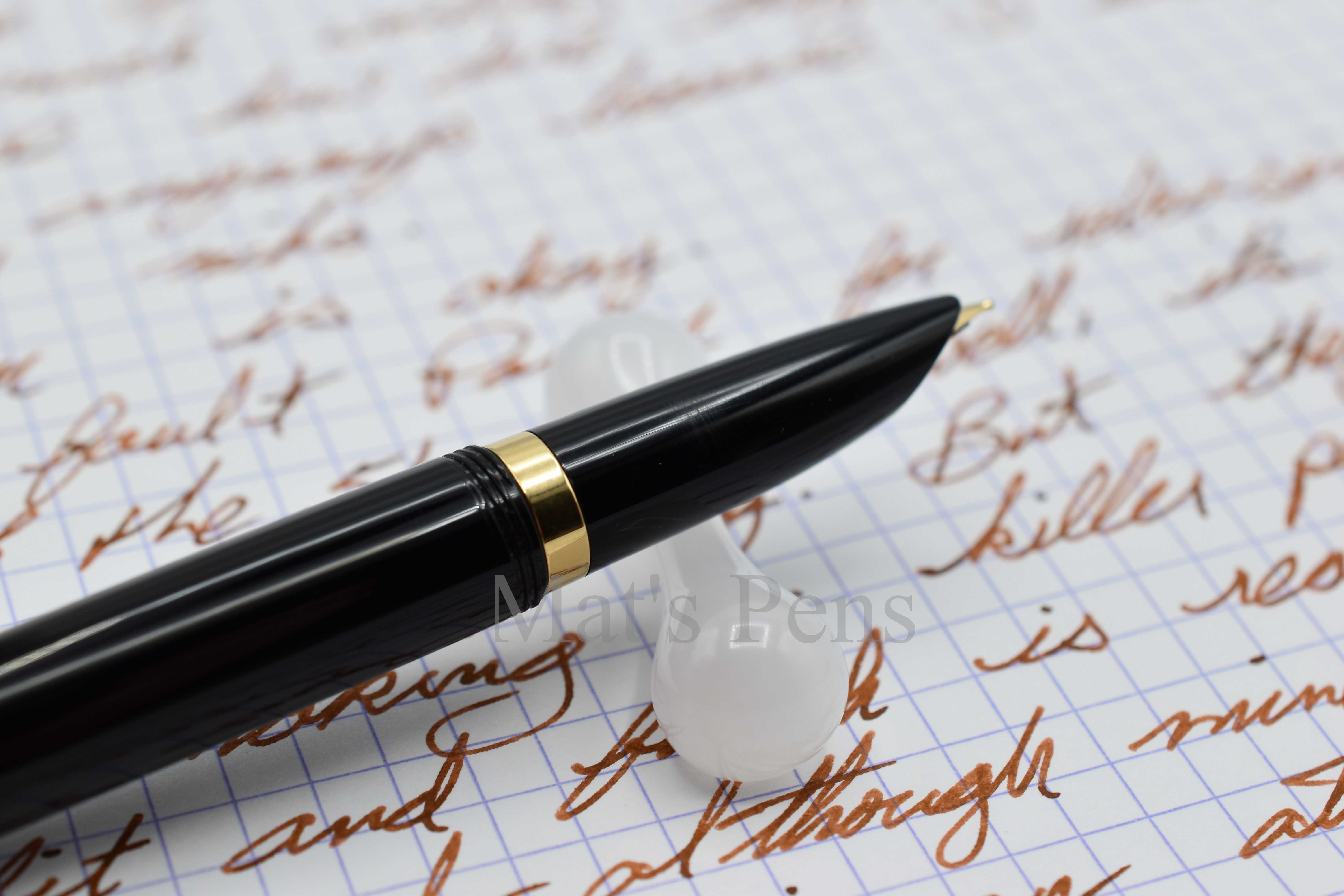
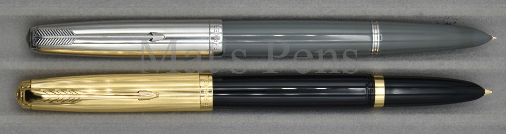
The pen is available in two flavors–the base model with a brushed metal cap and the Deluxe version, shown here, with gold plated trim. The base model has a steel nib, the deluxe has an 18k gold nib. I don’t know if the 18k nib was worth the up-charge ($160 more. Really guys?) but I like gold nibs and I like having a desk drawer full of black pens with gold trim, apparently. So I opted for the deluxe.
A closer view of the cap striations and clip. Everything is nice and smooth and well done.
The fit and finish is great. Everything is nice and smooth. The threads work like they’re supposed to.
Speaking of threads, the cap is threaded to the horror of P51 old-heads everywhere. There is a lot of talk about the cap being metal and the barrel being plastic and how that will lead to threads that will totally strip out and be worthless, but I think that’s largely a theoretical problem. I have probably half a dozen pens in my reach right now that have some metal component that threads into some plastic component and I’ve yet to have something strip out.
The dreaded threads. Note the scuffing on the section just from uncapping and capping. I don’t think this soft plastic is to going to hold up well long term.
The cap striations are tastefully done and very smooth to the touch. The modern arrow clip is springy and works. The cap twists off in one revolution and posts fairly securely. I’ve had the posted cap wiggle off a few times while writing, but I feel like the cap throws the balance of the pen rearward so I’d rather write with it unposted for longer sessions anyways. The cap almost weighs as much as the pen, and in my experience this generally leads to weird balance issues.
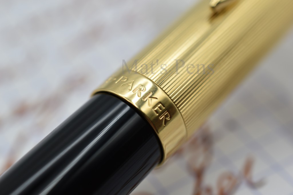
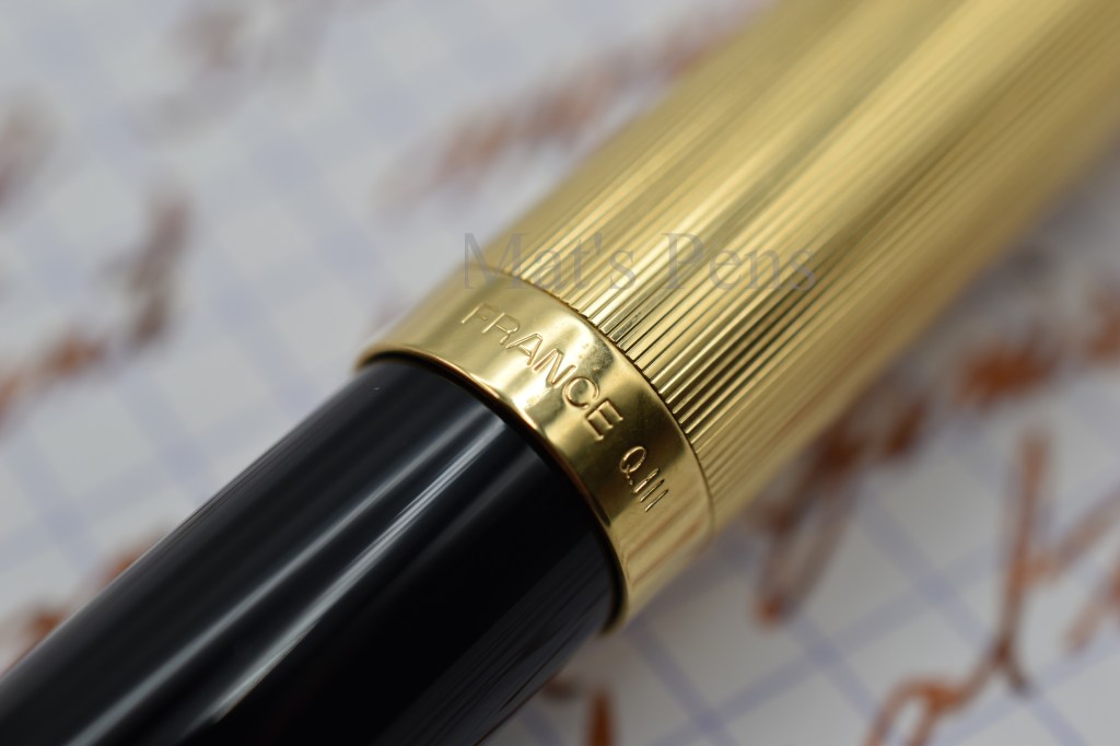
Cap lip engraving.Cap lip engraving, reverse. The pen is made in France. Also shown is Parker’s date code.Cap finial. Also shown is some vent holes in the cap.
My biggest complaint about the pen, and the complaint I see the most from other reviewers that are not diehard Parker aficionados, is the pen feels light and cheap. No precious resin or acrylic, here, it’s straight-up injection molded plastic. The soft, super lightweight, easily scratched, bleh kind of plastic. It doesn’t feel rough, there are no injection molding lines or sprue marks, it just feels unimpressive. I know Parker can make a pen that feels good in the hand. Their fit and finish is outstanding on this pen and their other modern, high-end offerings. But they cheaped out on the body of the pen. Not good. That’s the part that gets the most touch! Why make a lovely a cap for a pen body that, honestly, kind of sucks for the price? ($87 for a base model with steel nib, and $248 for the deluxe, by the way.)
Of course, the feel of the plastic is pretty subjective. But surely Parker knew that this pen was destined to be carefully compared to the acrylic vintage P51 and the leagues of cheapo Chinese copies? Knowing that, why would you make the body feel closer to the Hero pens of the world instead of the titular legend? Especially at $248.
I’m willing to bet that a lot of the design choices Parker made for this pen would be overlooked by the fountain pen community at large if the new model was made of acrylic. Or whatever plastic they made the Duofold out of. Just not…whatever it is. Especially considering that this pen writes very, very nicely.
Mine has a medium nib and it was just a touch over-polished out of the box–only enough that the pen hard-started on smooth paper like Rhodia but was fine on everything else. That’s a pretty easy fix for me, and many users probably would have found it completely acceptable.
The pen fills with Parker’s cartridge/converter system. I don’t like Quink so I don’t use Parker cartridges, but the converter works as it should despite its weirdly small capacity. Even though the host of vintage 51 fanatics will heartily disagree, It’s completely unrealistic to expect Parker to re-release the 51 with an aerometric filler (or, God forbid, as a vacumatic) when 99% of their customers will be happy with the effective, easily serviceable, and replaceable system. I take zero issue with Parker’s cartridge/converter system and their decision to use it.
Fills via Parker converter. No problems there. I added an o-ring to the converter knob so it doesn’t rattle against the barrel.
I am not a huge Parker devotee (my allegiance is to Aurora), so I can objectively say this pen is pretty decent. It’s not going to win over any vintage Parker addicts. It’s not the vile abomination said addicts accuse it of being, and it’s quite a bit better than the $2 copies floating around eBay and AliExpress. I give Parker a C plus–it’s not bad, but I know you guys can do better.
Pros:
Outstanding fit and finish.
A great writer.
Cons:
It feels too cheap. This could be rectified by using a better plastic or dropping the price. All of Newell’s fountain pens suffer from the same problem: The MSRP is too damn high.
Weird balance–the cap is too heavy for the pen. Or, more accurately, the pen is too light for the cap.
Anything remotely Parker-51ish will always live in the shadow of the titan that is the Parker 51. Also annoyingly, I have to forever more clarify that I’m talking about the original P51. Thanks a lot, Parker.
Alternatives:
Higher-end alternatives that are better pens for less money include:
Vintage Parker 51, the obvious choice. You Parker folks happy? I’ve conceded that the old-school P51 is still the king of this mountain.
Lamy 2000. Helluva lot better for helluva lot less money.
Pretty much any hooded-nib Aurora. Take your pick from this huge family, including the modern, commonly available, and cheaper Duo Cart.
There are dozens of Parker copies of varying levels of quality that might scratch that itch. My favorites are still the Kaco Retro and the Wing Sung 601.
Specs:
Cap:
Gold plated metal with striations.
Base model is brushed metal.
Threaded, one twist to remove.
Nib:
Hooded, 18k on this model, steel on the base model.
Fine or medium, shown in medium.
Body:
Injection molded plastic.
Deluxe model available as black or plum.
Base model available in blue, teal, burgundy, or black.
Filling system:
Parker’s cartridge/converter system.
Pen came with a piston converter, but apparently the base-model does not come with a converter. That’s pretty crappy, Parker.
Converter capacity is 0.5mL.
I’ve also checked and confirmed that the Parker slide converter and Aurora cartridges and converters (including the weirdo Trik-Trak converter) all fit in the pen. If the user is so inclined.
Length:
Capped: 140mm
Uncapped: 118mm
Posted: 153mm
Weight:
Total: 23g
Pen: 12g
Cap: 11g
Section Diameter:
8-10mm
This is the last post on pens with hooded nibs for awhile, I promise. I don’t have any more to review.
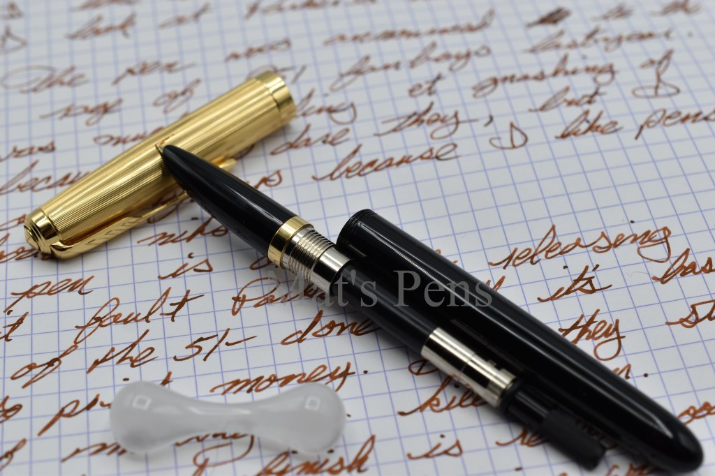
Original P51 versus the new.Ink is Platinum Mix Free Earth Brown, a lovely red-brown. It appeared very red in this scan but is true to color in the photos above.
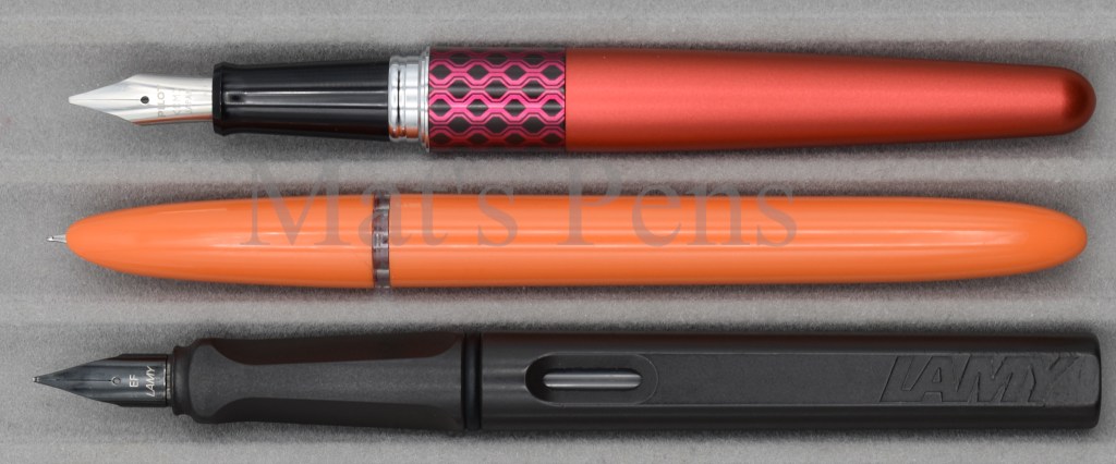
It’s been awhile, but I’m back with a really cool, inexpensive pen!
Kaco seems to be a new-ish Chinese stationary company, founded in 2011 and headquartered in Shanghai. At least according to their website.
Kaco seems to be making unique designs, including a bunch of interesting looking fountain pens that I’ll check out in the future.
I like pens with hooded nibs and I have a sub-collection of them going on, so as soon as the Retro appeared on my radar I bought one. It only set me back $16, so I figured I wouldn’t be out much if the pen was crap. To my surprise, this pen is nothing but crap–it is a solid, well-made, and inexpensive workhorse of a pen.
This pen is an original design. It’s not trying to copy a Parker 51–rounded ends and a hooded nib are not enough for me to classify it thusly. There are no fake clutch cap rings, no arrow clips, nothing like that. I have reviewed severalpens that are clearly trying to copy Parker’s design. This isn’t one of them. But with a name like Retro, obviously they’re at least acknowledging that it is a homage.
The pen came in a simple box with two black standard international short cartridges and one genuine German-made Schmidt K1 converter. I was already pretty impressed at this point–here we have a sub-$20 pen with honest-to-goodness standard international cartridges and a decent converter!
The pen came in a simple plastic box with a converter and two black cartridges. The pen also came with some filling instructions below the tray written in Chinese, not shown.
All too often with Chinese pens in this price range, I see semi-proprietary standard international-ish cartridges (if any) and flimsy mystery converters that work some of the time. Many pens above this price range from other common brands don’t even come with converters–Like Lamy. Well done, Kaco.
The pen came with a Schmidt K1 converter. Not fancy, but reliable and functional.The pen can be filled with a full-size standard international converter, short standard cartridge, or long standard cartridge. The barrel has enough room to accommodate a second short cartridge if so desired.
The pen is simple and very lightweight. It’s not exactly the pinnacle of pens–it still feels like a cheap, brittle plastic pen–but the fit and finish are surprisingly on point. The plastic is very nicely polished. The section threads are smooth and satisfying to use. It wrote without hassle or adjustment. Other than the injection molding marks on the cap finial and the end of the pen, I’d go so far as to say the fit and finish was flawless out of the box. There are very few brands that can make that claim, and fewer yet in the sub-$20 category.
The threads are clear and form a sort of ink window by the section, but it is not really useful for determining the ink level of the converter. Too small and too low on the converter. I do get the sense that one could convert this pen into an eye dropper with some silicone grease on the threads, which would make the ink viewing window more useful.The only feature on the end of the pen is this injection molding mark.
The cap uses a slider/pseudo-clutch type cap not unlike the system used by the Pilot E95s. The mechanism is smooth and satisfying and keeps the cap in place during capping or posting. The cap also seals well. No dry-outs or other weirdness with this one.
Likewise, the cap finial is rounded with an injection molding mark.
One of my favorite elements of this pen is the clip–a simple, bent wire with a plastic sphere on the end. It holds the pen tightly in a pocket and is whimsical and practical.
I really like the clip. It’s a simple bent wire with a plastic ball at the end. It’s functional and quirky.
As stated, the pen wrote without drama out of the box. It’s not the greatest writing experience ever–it’s a standard P51-style steel nib that writes with a bit of feedback and is fairly position-sensitive but otherwise gets the job done. The pen can suffer from a bit of ink starvation with long writing sessions, but it is fully tolerable.
The nib appears to be a simple, folded steel P51 style nib. It wrote just fine out of the box. I tried to remove the hood from the pen to see what the internals were like but I was not able to do so (non-destructively.)
There is not much more I can say about this pen. I was genuinely impressed–and that takes some doing nowadays.
Pros:
Comes with everything you need.
Fit and finish are impressive for the cost.
Really, this is a high-value pen.
Cons:
The ink window doesn’t work.
It feels plasticky.
The whimsical design may not be for everyone.
Alternatives:
If you’re looking for a cheap Parker 51-esque pen or pen with a hooded nib for under $20, this is your ticket. There’s not another one out there that even comes close to competing with the Kaco Retro in build quality. That said, the Wing Sung 601 or 618 pens are worth considering if you prefer their aesthetics or want a pen with a filling system other than a cartridge/converter set up.
If you are a newbie just looking for a fountain pen to get started on, the Kaco Retro should be high-up on your list, along with the often mentioned Pilot MR series or Lamy Safari/Vista. Also consider the Pilot Kakuno.
Specs:
Cap:
Plastic with wire clip.
Clutch-type closure mechanism.
Posts very deeply and securely.
Nib:
P51-style folded steel nib.
Sold to me as an extra-fine, but I’d say it’s closer to a fine or medium.
Body:
Injection molded plastic.
Shown in orange.
Available in red, blue, white, black, and turquoise.
Filling system:
Standard international cartridge or converter.
Compatible with long international cartridges.
Can store a second short international cartridge in the barrel if so inclined.
I haven’t tried it, but I’m willing to bet that one could eyedropper this pen with some silicone grease.
Length:
Capped: 146mm
Uncapped: 127mm
Posted: 147mm
Weight:
Total: 15g
Pen: 9g
Cap: 6g
Section diameter:
9-11.5mm
Top to bottom: Pilot MR Retro Pop (Metropolitan), Kaco Retro, Lamy Safari. Top to bottom: Pilot MR Retro Pop (Metropolitan), Kaco Retro, Lamy Safari. Top to bottom: Pilot MR Retro Pop (Metropolitan), Kaco Retro, Lamy Safari. Written with Iroshizuku Fuyu-Gaki. Writing appears broader than normal for this pen because the ink is so wet and it appears way, way more pink in these scans than it does in person. See photos above for the ink color–it is almost a perfect match to the pen itself when viewed live.
After my last huge post and a rather rough semester, it’s probably time for something a bit less esoteric. A simpler pen, a simpler review.
Jinhao pens tend to be fairly well made and they tend to more-or-less work out of the box–all for a decent price.
At first blush, the 51A looks like another Parker 51 clone. It’s even named the 51A.
The internals of the 51A are actually completely unique, at least compared to a Hero 616 or similar–pens that are literal copies of Parker’s design. So the 51A, in passing, looks very much like a Parker but it is superficial only. Jinhao didn’t just buy a bucket of nondescript 51 clone parts and cobble a “new” pen together.
The only reason I’m sticking-up for a $12 pen is because its reputation as just another cheap P51 ripoff isn’t fully deserved. This pen wrote out of the box. The same cannot be said about a lot of modern pens, both below and well above this price range. Yeah, it is clearly inspired by the Parker 51, but so was the Lamy 2000, Aurora 88, Waterman Taperite, Montblanc 14, Esterbrook Phaeton 300, OMAS 361, and . . . so. . .on. That’s not a measure of a bad or good pen–whether it writes or not is. And the Jinhao writes.
That’s not to say Jinhao hasn’t outright copied old pen designs–they absolutely have, and continue to do so. This just isn’t a great example of that practice.
And I am definitely not saying this pen is better than, or even equal to, a Parker 51. It’s not. But I don’t think its trying to be, either.
Simple, brushed-metal cap. Good on Jinhao for using their own clip design instead of just another arrow clip.
The 51A is very light. The metal cap shifts the balance rearward when posted, but it isn’t that heavy and it posts deeply and securely, which mitigates the balance shift. The cap operates on a clutch mechanism like a Parker 51 and it works fairly well. The clip does what it is supposed to do with little drama.
The clutch ring works as it should, for the most part.
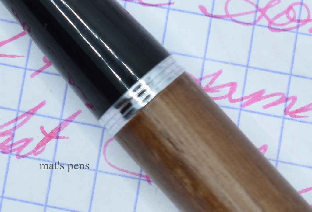
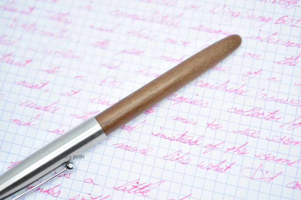
The pen’s body is wood–I think this one is peach wood, or it was sold to me as such. Apparently peach wood wands, amulets, and so on are believed to keep evil spirits at bay in Chinese culture. At least according to Wikipedia. I thought that was a neat tidbit and it would make sense to use peach wood to make things one would be carrying on their person. In any case, the wood wasn’t exactly smooth out of the box, but I polished it a bit with some micromesh. Now it is smooth and organic feeling and aging rather well. Of course, there are a bunch of different materials available besides wood.
The wood is light, thin, and feels sort of cheap but at the same time it adds some depth and life to a functional but unexciting design.
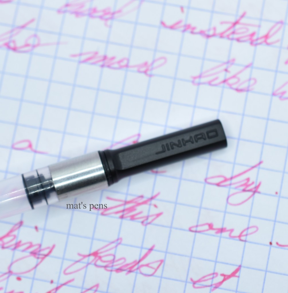
It fills with a cartridge/converter system. Jinhao uses a system that is vaguely patterned after the standard international system and people have had success making standard cartridges and converters fit. The pen did come with a Jinhao-branded converter so I haven’t had to mess around with trying to make other converters work.
It works. It’s loosely patterned after the Lamy z27 converter.
Interestingly enough, this model can optionally be purchased with an open nib, if one likes the pen but prefers a larger nib instead of the hooded design.
For the price, this is a decent pen. The fit and finish is good enough, the pen writes, and the 51A line has some interesting options. I think this is a nice beginner pen or a good choice for someone who likes the aesthetic but who does not want or cannot get a Parker 51. I think there are a few better choices out there for this type of pen, but there are many that are far, far worse.
Pros:
Inexpensive.
It works.
For the price, the fit and finish is acceptable.
Cons:
The pen will always live in the shadow of the Parker 51. The brand as a whole isn’t exactly known for its innovative design and this pen is no different.
It’s a pretty dry writer.
It feels really cheap. The wood is super thin and feels fragile. The capping mechanism works how it is supposed to but it feels like you’re dragging a brick through a gravel parking lot the whole time. Little details like that. On the other hand I think I paid $12 (shipped!) for this pen and the price has dropped since then–so like I said, probably acceptable for the price but don’t think for one minute you’ll get a pen on par with a Parker.
Alternatives:
There really are a million alternatives. Just find one that suits you at the price you like. I do not recommend Hero pens, but the following are closely related and great alternatives. In general:
Parker 51. Yep, I’m still that guy–save those pennies and find a user-grade aerometric Parker 51. You’ll never need a different pen in your life, you can give it to your grandkids when you die. The P51 will live happily ever after that. I’m not even a Parker guy and I believe it–these are good pens with an entire industry built around ensuring that they are in use for another 80+ years.
Kaco Retro. A relative newcomer, and a pen that cannot truly be called a knock-off P51. These are cool little pens and easily my favorite non-premium option in this list. Such a whimsical, cool design with performance to back it up. Only $5 or so more than the Jinhao and worth every penny. Highly recommended.
Wing Sung 601. This is still the best outright P51 clone, in my opinion. Wing Sung, like Jinhao, likes to copy designs but they built a better pen than Jinhao in this case. Around $10 more than the 51A.
Wing Sung 618. Still a weird design, but still an interesting pen. $10-$13 more than the Jinhao.
Specs:
Cap:
Clutch-type, metal cap.
Nib:
Parker 51-style folded steel nib in fine.
The pen can be purchased with an open #5 nib instead.
Body:
Peach wood.
Various plastics and other materials are also available.
Filling system:
Cartridge/converter system (technically proprietary but close enough to standard international.)
Length:
Capped: 139mm
Uncapped: 128mm
Posted: 148mm
Weight:
Total: 20g
Pen: 11g
Cap: 9g
Section diameter:
8-11mm
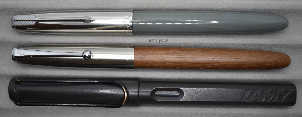
Top to bottom: Parker 51, Jinhao 51A, Lamy Safari.Top to bottom: Parker 51, Jinhao 51A, Lamy Safari.Top to bottom: Parker 51, Jinhao 51A, Lamy Safari.
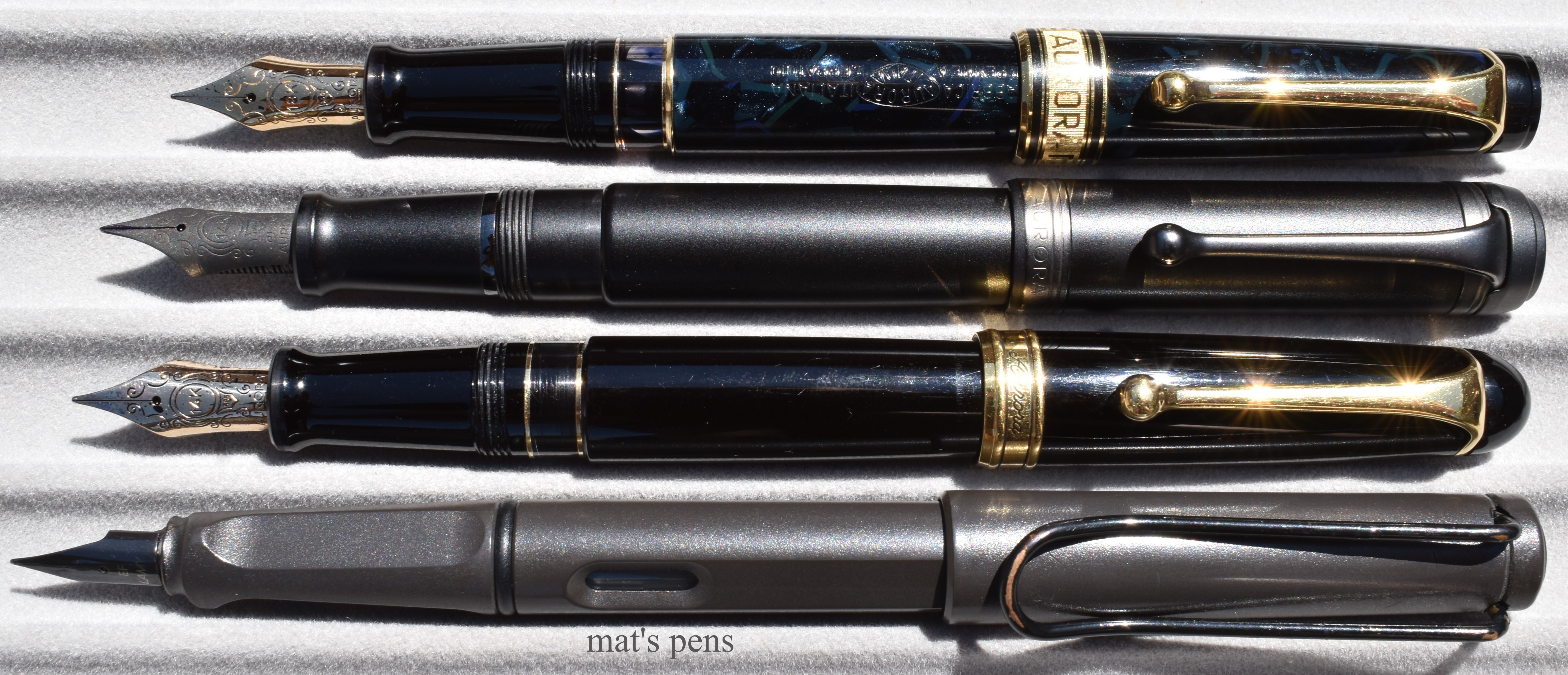
This is an exceptionally exciting post for me–one that is several years in the making. I want to review the original Aurora 88 and all of its descendants because I have an example of all of them (with three exceptions that I’ll get to). I also have some cool documents and paraphernalia I wanted to share, too–partly because I’m an Aurora fanboy/nerd, but also because the English-language information available on these pens is lacking.
I have two main sources of information that I’m citing. The first and most important is Leticia Jacopini’s book La Storia della Stilografica in Italia 1900-1950, Volume One. I own a hard copy of the book, but both volumes are available for download on her website. Her works are the single best resource on Italian fountain pens in English bar none, change my mind.
The second source was an unbelievably detailed post from 2009 by the user “diplomat” on the Fountain Pen Network, here. I’m not a member of FPN–they never bothered to respond to my email for membership–but I have to give credit where credit is due. edit: okay, I’m a member of FPN now, on good terms, as of December 6th. They underwent an extensive site upgrade and users being unable to register was a known issue. I won’t hold it against them.
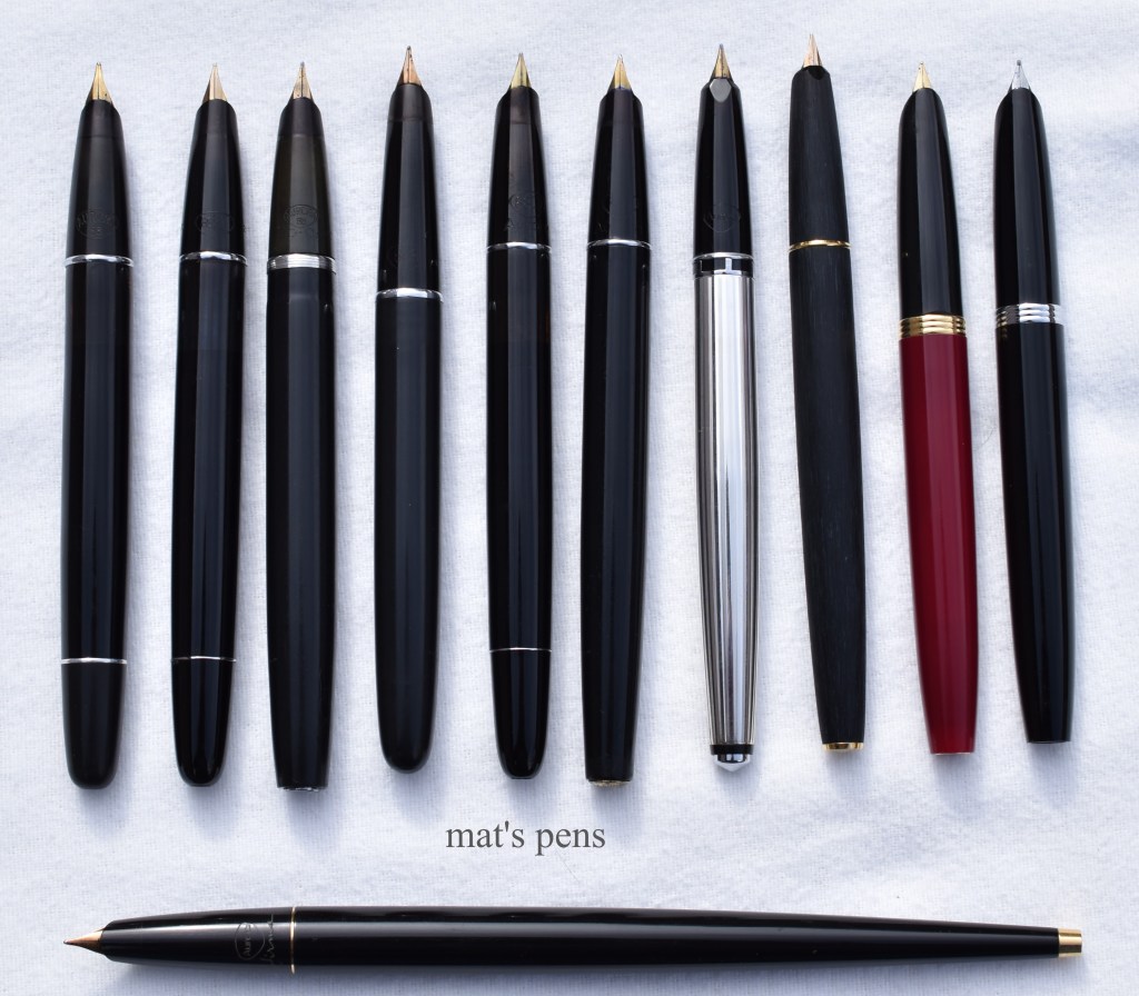
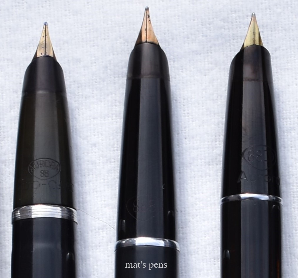
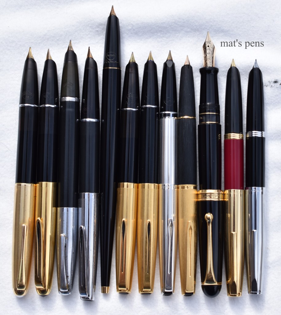
Left to right: 88, 88K, 88 Duo Cart, 888, 88P, 888P, 98, International, 2017 Duo Cart, 2019 Duo Cart. The Firma is pictured below. Left to right: 88, 88K, 88 Duo Cart, 888, 88P, 888P, 98, International, 2017 Duo Cart, 2019 Duo Cart. The Firma is pictured below.Left to right: Firma, 88, 88K, 88 Duo Cart, 888, 88P, 888P, 98, International, 2017 Duo Cart, 2019 Duo Cart.
Before getting into more individual detail, I wanted to cover a few more similarities here to avoid repeating them numerous times. The 88, 88K, and 88P are all piston fillers. They will always have to be restored to working order when you get them, even if the seller claims the pen is in working order (it’s not, I guarantee it, or it won’t be for very long in the best case scenario). One can trust some restorer/sellers like David Nishimura or Mike and Linda of Indy Pen Dance to restore these prior to selling them, but the vast majority of sellers, especially on eBay or similar, will not bother with them. While the process is not hard, in principle, the threaded piston head is incredibly fragile and will usually crumble to dust during the restoration. I recommend that you send these to a pro for restoration. It would be awesome if someone with the know-how could figure out how to 3D print these pistons–then restoring them would be a trivial task akin to replacing a sac on a lever filler. (If you figure out how to do it, I’ll happily buy a dozen of them.)
The oldest 98’s are also piston fillers, but the mechanism is completely different and made of more durable, modern materials. These typically will function okay without a lot of drama.
Newer 98s, the International, and the new Duo Cart pens all use Aurora’s cartridge/converter system, which is readily obtainable.
The rest of the pens are cartridge filled and were never intended to be used with a converter–converters didn’t exist. The pens use old Aurora Biflux cartridges, which are obsolete and not made anymore. By sheer coincidence, Platinum-brand cartridges and converters will mount on these older pens. Because they were not meant to fill via a converter, filling them in such a manner can be fiddly, but it can be done. One could also refill the vintage Aurora cartridges, but I have chosen to retain my cartridges as they are for the sake of collecting.
There were two styles of cartridges–the original cylindrical cartridges (right and bottom, all used), and the later cartridges with a neck (top left, one unopened, one used). Also pictured are the metal carriers that held them back to back in the pens–both generations of cartridges will fit in the carriers.An early-modern intact Aurora cartridge with an intact vintage cartridge. Standard international cartridge for scale.Platinum converters fit these older pens, likely by sheer coincidence. I had to modify the top converter to fit in the Firma pen by removing the gold ring at the open end, but otherwise I have had zero issues with this method. Shown with modern Aurora converter for reference.
Because I collect Aurora fountain pens, I incidentally also collect Aurora ballpoints and merchandise more broadly, so I’ll be including that information as well. A quick note on vintage Aurora ballpoints: modern-day ISO G1-style refills (a la the Schneider Express 225 or Aurora’s own Wagon refill not Pilot’s G1!) are dimensionally identical to Aurora’s old ballpoint refills except the modern refills have a plastic tail. Sometimes they fit without modification, but one can also trim the tail back to get them to fit. As far as I can tell, all of Aurora’s pre-1970 ballpoints use the ISO-G1/Wagon refill, at least until they adopted Parker’s standard of refills for all of their pens. Even today, the Wagon refill is used in Aurora’s skinny ballpoints, so they are available.
Top: original Aurora Magnum Refill. Middle: slightly modified modern Aurora Wagon Refill from my 88K ballpoint. Bottom: unused modern Aurora Wagon Refill.
No matter what anyone tells you, the original 88 was not a flex pen. It just wasn’t, pure and simple. The nibs on the early 88’s were quite responsive, maybe I’d go so far as to call them soft, but only if they are equipped with the soft nibs in the first place. Aurora offered 17 nib choices on 88s, and while most of them are, indeed, of the soft extra fine, fine, or medium variety, not all of them were. The nibs on all but two of my pens are downright rigid. I use the term “soft” to differentiate Aurora’s old-school standard nibs from their stiffer nibs throughout this post. I do not recommend these pens for users looking for flex–go get a Waterman 52 or a Mabie-Todd Swan. Hell, even a Sheaffer Jr. with a Junior nib is a better flex pen. I’m serious. You’ll be disappointed. Now, if you’re looking for a bouncy, responsive nib that can add a little bit of flair to writing, you’ll be in luck.
Finally, that Aurora feedback that us Aurora people gush over? Oh yeah, that’s here in droves. And I love it.
Small but mighty.
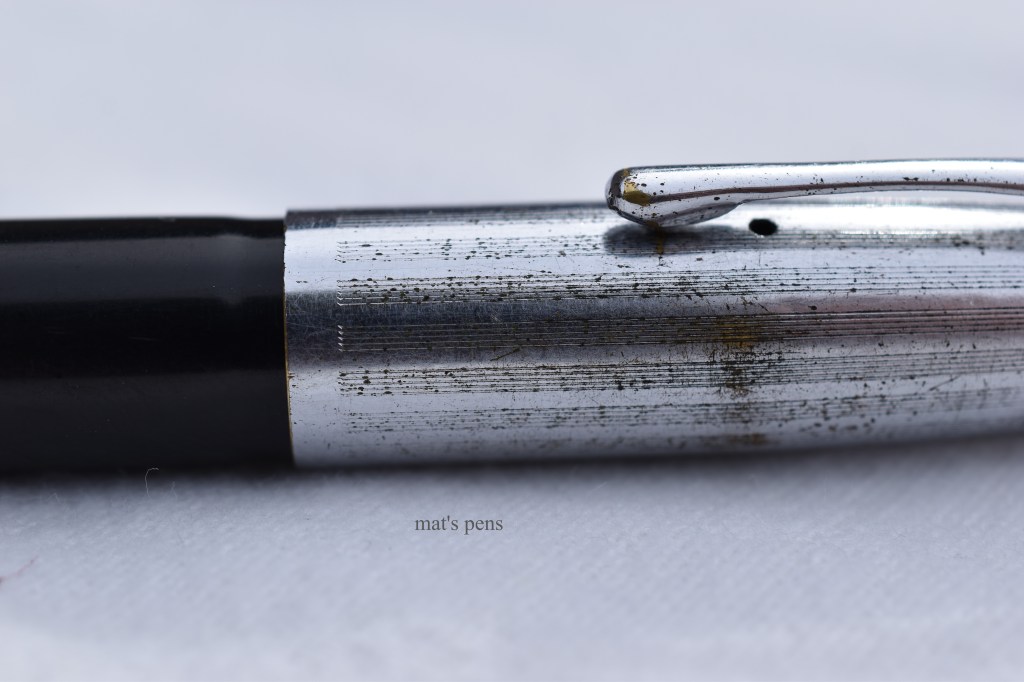
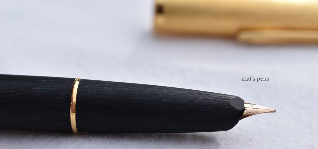
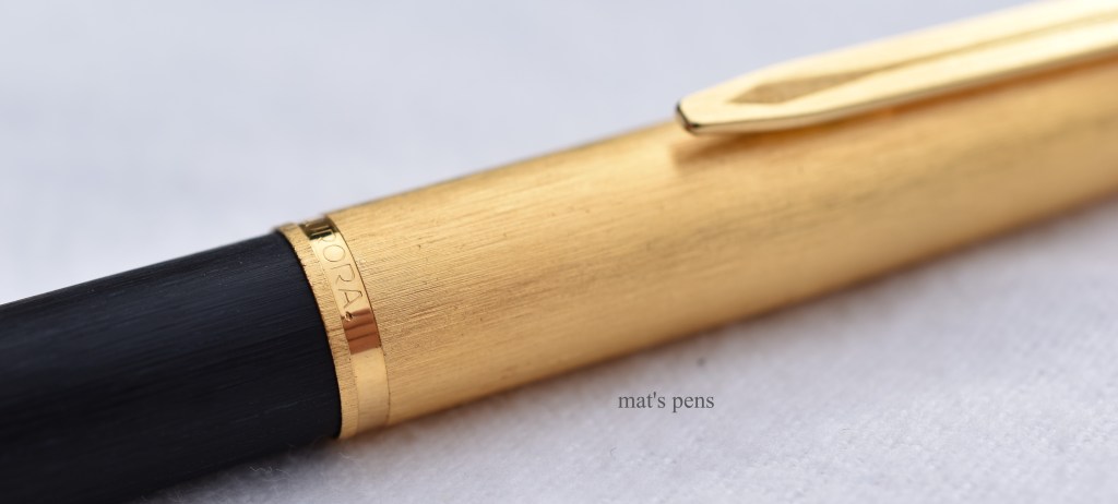
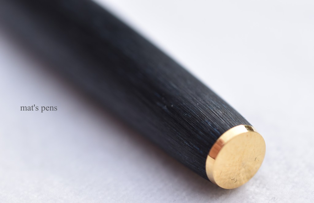
The 88 was designed by Marcello Nizzoli and released around 1946. The pen is simple in its elegance–a round, cigar-shaped pen made from black celluloid and featuring a metal cap. There aren’t a bunch of different finishes for the 88, but there were many options for the caps, including gold plate, Nikargenta, chrome, sterling, rolled gold, and so on. Mine is a gold-plated cap, which seem to be the most popular option. Again, the 88 fills with a piston and has a nice, functional ink window. The section of the pen, as well as the piston knob, are black ebonite.
Apparently there were also all gold-plated pens and solid gold pens, but I’ve never actually seen one.
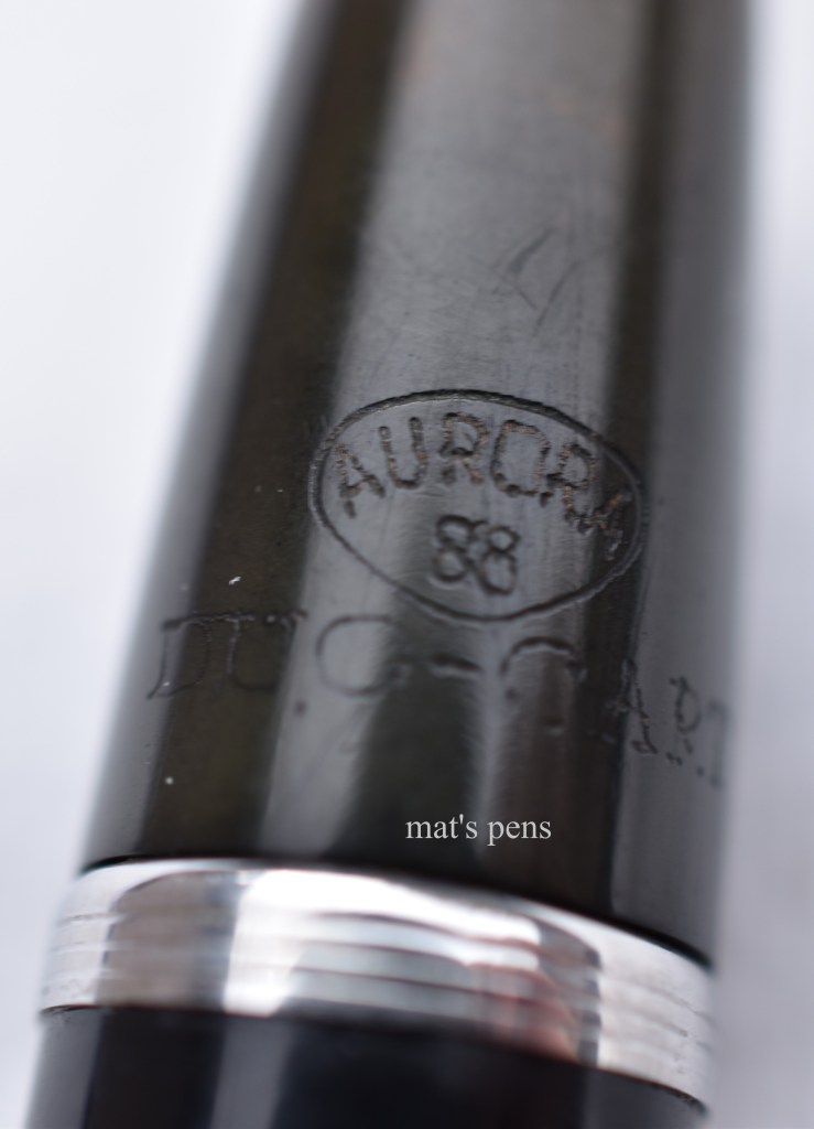
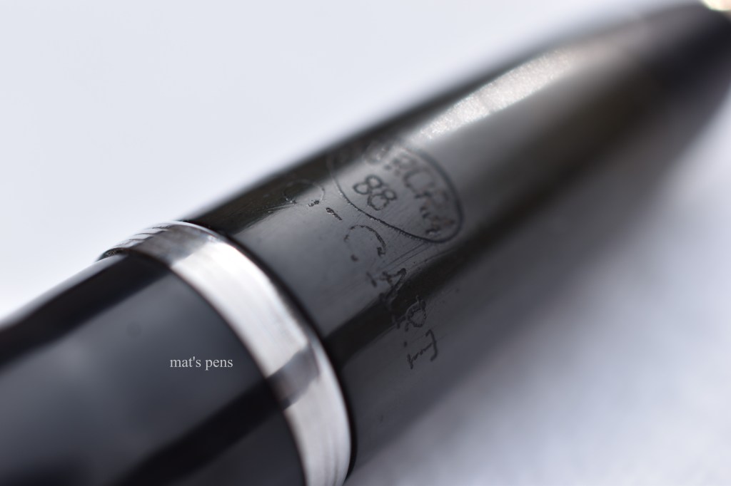
The striations on the cap are very fine and tastefully done. The clip is a simple, functional piece.The cap finial is shiny metal.Aurora had a long history of engraving their sections and this practice persisted after the war. “Aurora” and “88” inside of Aurora’s shield logo. Not shown is the pen’s serial number, on the reverse.
The star of this show is the nib. Most of the early pens were equipped with either a soft fine or soft medium nib, indicated by a colored dot on the end of the pen–which was missing from mine. Only specialty nib grades were engraved on these pens, which leads me to believe that this pen is a standard issue, soft fine.
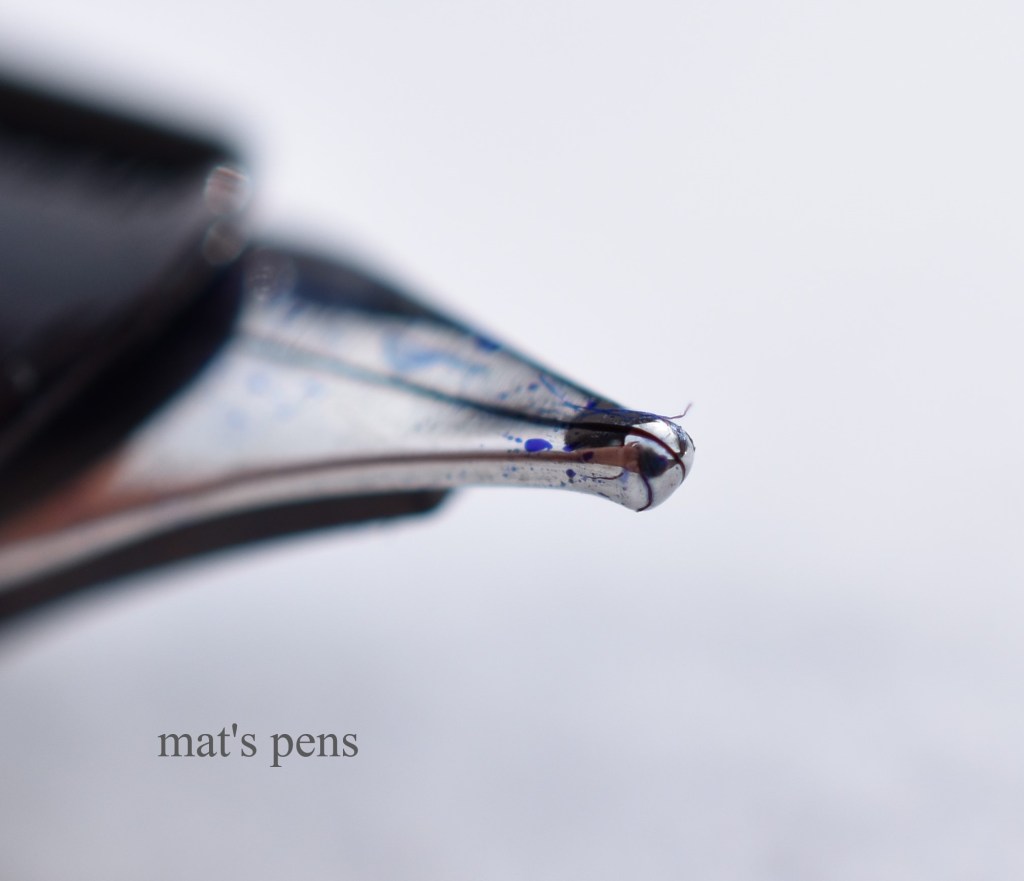
It’s gloriously feedbacky and super responsive. I cannot really describe it. It feels like a vintage Aurora in the best way possible. I know I said don’t flex these pens, but just look at this:
That is with practically zero effort. It is fantastic.
With user-contributed serial numbers and a lot of speculation, users on Fountain Pen Network (again, I’m not affiliatedLOL JK guys) generated approximate dates of manufacture. My 88, using their list, was likely manufactured around 1948, give or take.
The 88K was released around 1953, with some overlap in production. The pen itself is dimensionally identical to the original 88. The biggest non-aesthetic change that Aurora made was they began to manufacture the 88K’s section and piston knob out of celluloid.
Aurora used this style of clip well into the 70s. The striations on the cap are not as finely engraved as before.The shiny metal finial was replaced by a black lacquered or painted metal finial. It’s much more pointy than the original, too. Also note the more pronounced cap striations.This is actually the matching ballpoint and is the earliest example I have in which Aurora stamped their brand on the cap’s lip, something they still do to this day. Notice how the letters are uneven. This stamping only appears on the ballpoint.Here, 88K is engraved in Aurora’s shield logo. The serial number appears, as does the nib grade and the Aurora name.
The 88K was available with the same cap options and nib options as the 88. I actually have seen pens that were entirely gold-plated, unlike the 88, so I know those exist.
My pen is equipped with a hard fine nib. It’s rigid, smooth, feedbacky, and wet.
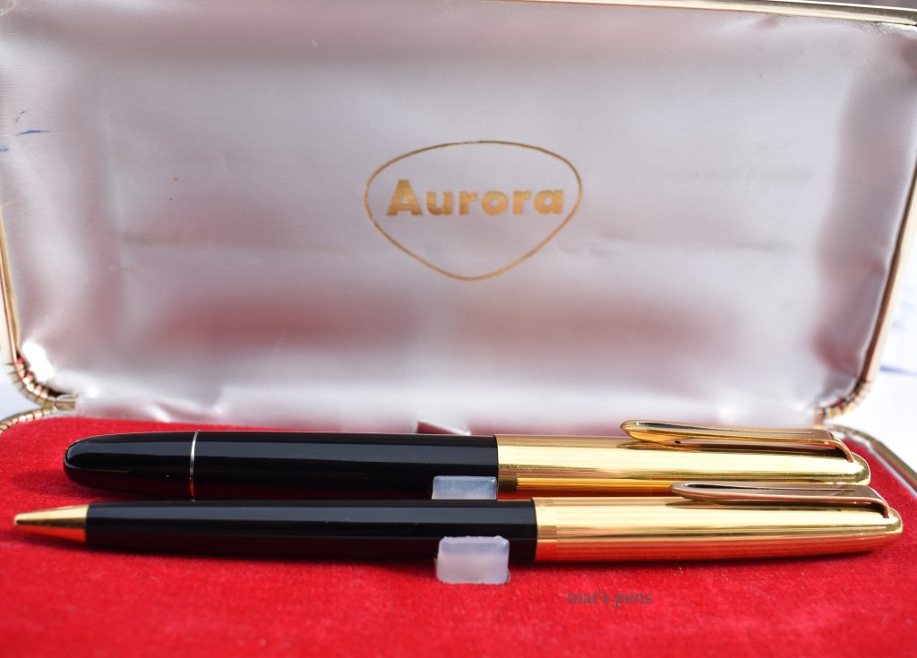
My 88K came to me new old stock in a box labeled FIAT. It was likely a corporate gift that sat in a desk somewhere for 65 years before coming to me, along with all of the sweet retro paperwork!
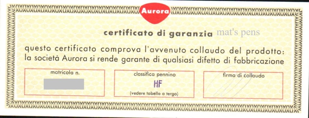
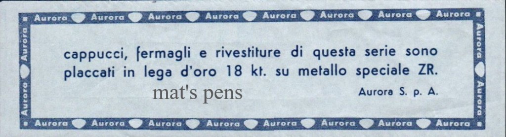
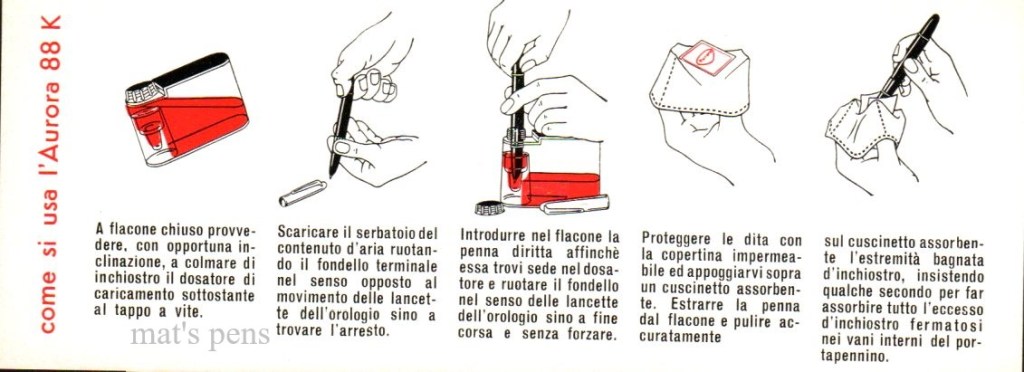
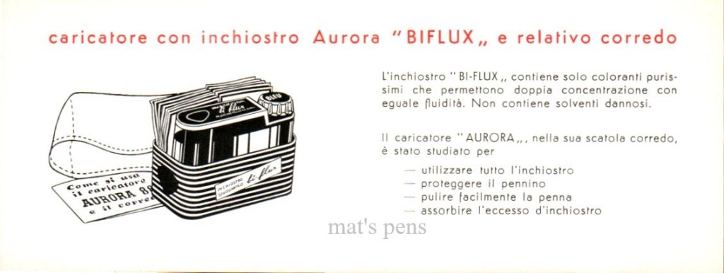
HF=Hard FineNib grades. Aurora themselves said, on this page, that 93% of users are served just fine by soft EF, F, and M nibs, shaded in yellow. That’s probably why 93% of their pens are EF, F, or M. They also offered obliques and stubs–I would love to get my hands on one of those soft OBB nibs! The writing in red states that an H indicates a hard version of a given nib. The D nibs, as far as I can figure out, were manifold nibs (Google translate tells me that the word ricalco that appears below the headings means “tracing”). I don’t know what the K nibs were–like a waverly-style nib, maybe?This is just informing the user that this pen uses 18k gold plating on the caps, apparently.Filling instructions with the Aurora Biflux ink bottle. We need to get Aurora to put ink in a bottle like this again.
My 88K was made around 1955.
Next came the Aurora Duo Cart in 1954, which was revolutionary in its own right. This pen was an early example of a cartridge pen, mostly aimed at school kids. Aurora used the sections right off of 88’s in an attempt to cut some costs, so these pens write just as well as full-fledged 88’s. The pen used the dual cartridge carrier–seen above–and when the user was out of ink they were to discard the empty cartridge and flip the carrier around. An ink alarm feature–a tiny ball on the end of a tiny chain in the pen’s barrel–reminded the user to get a new cartridge. This feature is more annoying than useful and was omitted in Aurora’s later cartridge pens. Modern users are forced to find a way to disable this alarm–I cut the nipple end off an empty international cartridge and placed it over the turning knob of the pen’s converter to act as a spacer to keep the alarm from driving me nuts.
Unfortunately, my 88 Duo Cart is in rough shape–tons of cap brassing, the clip is loose and floppy, and the jewel on the end of the barrel was obviously super glued into place at some point. But it writes. The nib feels very similar to the hard fine nib on my 88K; Aurora did not engrave the nib grade on these pens, so I’m left guessing once again.
The serial number is on the reverse. Even the school pens got serial numbers.Note that the 88 logo is identical to the 88 pens and DUO-CART added underneath.It’s seen better days.
The pens were available with a couple different plastic bodies and either black or red ebonite sections. I don’t know what Aurora’s serial number methodology was, but I get the sense that this pen was a very early 88 Duo Cart.
This pen is kind of cool. It’s aesthetically unique and different from the rest of the family–it’s a little blocky and chunky, and the short cap just works, in a weird way. The pen also changed the way people used fountain pens–cartridge/converter pens are the most prolific type now, and this was one of the earliest, commercially successful cartridge pens, along with the Waterman C/F that was introduced in 1953.
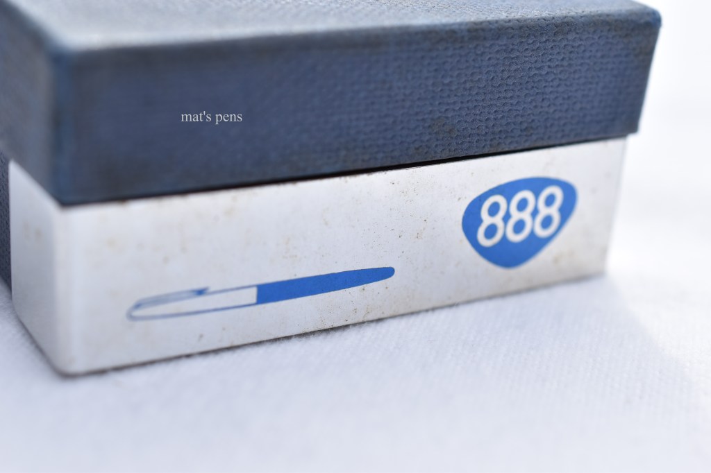
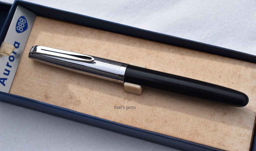
The 888 was a more grown-up version of the 88 Duo Cart and was released around 1956. It was a unique design, not just the section off of a more expensive pen made cheaper. It made use of the Duo Cart’s cartridge system with the ink alarm feature.
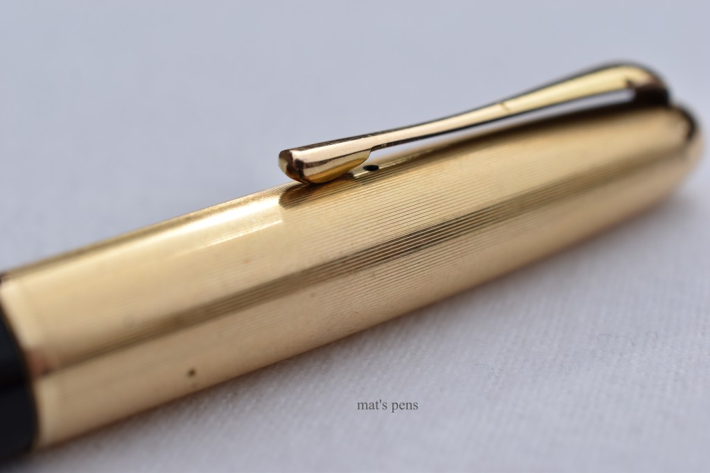
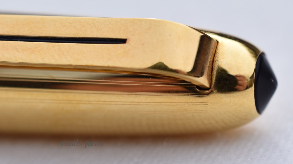
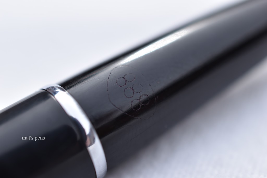
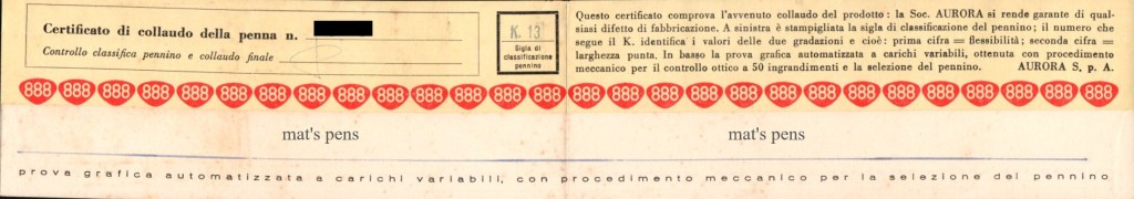
The lid swings open revealing what was a very modern pen by 1950s standards.888 is engraved in the Aurora shield logo. On reverse is the serial number and the nib grade–K13. Aurora is engraved to the left of this logo.The 888 (center) has a longer, more tapered section than other pens in this family.The pen stays true to the 88 family’s roots with a nice cigar shape. The plug at the end is where the ink alarm feature is attached.Interestingly, it introduced the cap style that Aurora stuck with for many years. The clip is the same as the 88K, but the domed finial is replaced by a slanted plastic disk.
The nib on this pen is a K13, which is stamped on the included warranty card and engraved on the pen’s section. Once again, I have no idea what the K nibs are supposed to be. The tipping material on this pen is not shaped like the K nib illustrations on the above documentation, but the nib is ever so slightly up-swept. Regardless, this may be my favorite nib out of all of these pens. It appears to be a fine and is slightly more rigid than the soft nib on my 88, but far more responsive than the hard fine on my 88K. It is perfectly tuned and an absolute joy to write with.
Of the cartridge converter pens I own in this family, this is by a wide margin my favorite, and is probably in the top three of my favorite vintage Auroras. The pen is very light, well balanced, and has a long, comfortable section. Plus it writes like a dream.
Unfortunately, people living in Italy during the late 50s were not as enthusiastic about this pen as I am and it was not the hot seller Aurora hoped for. The 888 was only made until 1959 or so; mine has a late-ish serial number and is probably a ’57 or ’58, if I had to guess.
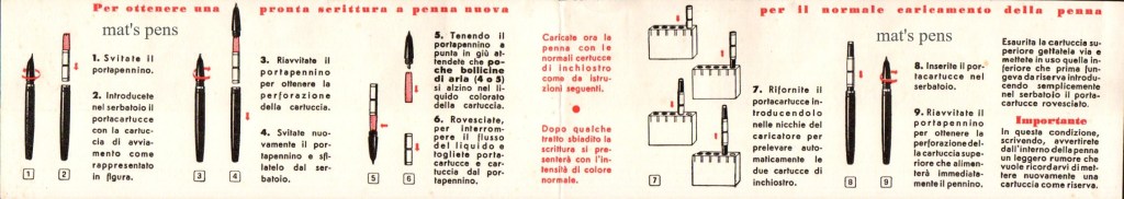
Warranty card. The 888 included a strip of paper showing the factory’s testing of the nib (shown at the bottom)Reverse of the above warranty card, detailing the use of the pen. Aurora’s Biflux ink cartridges shipped in a plastic holder (see the illustration #7).
The Firma (Italian for “Signature”) was released around 1957 and is an interesting, but often overlooked variant. Desk pens were far more popular in the past than they are presently.
The Firma uses Aurora’s Biflux cartridges just like the Duo Cart and 888, but it did not make use of the cartridge carrier or the ink alarm–I checked, the double cartridge carrier does not fit in the pen. I am not sure if they decided it wasn’t necessary for a desk pen or if they were already in the process of phasing the system out.
The pen itself came in a long, slender cardboard box.Section engraving. The serial number and “M” for medium nib are on the reverse. This one is still chalked, too!The long barrel tapers to a point and features a simple gold band.
The nib is a gloriously juicy medium and very pleasant to use. It is at this point that I noticed the pens start to feel much more “modern.” The sections and bodies on these newer pens are obviously plastic–not celluloid–and the nibs start to feel stiffer and are not as responsive. It’s still a good writer and it is nicely balanced, as desk pens tend to be.
The pen came with a thick glass base and pen trumpet–which looks like a rocket ship or something. It feels very, very late 50’s.
Thick, shiny black glass.The Firma logo is printed on the cork bottom and is still legible on mine, which I thought was pretty cool.
The 88P debuted around the same time, circa 1958 or so. It is widely considered to be the pinnacle of the 88 family of pens–it was made entirely in celluloid, the cap–which came in the same options as every other 88-type pen except Nikargenta–was the most finely engraved. I will admit that the 88P feels more refined than the 88K and much, much more modern than the 88–which would have been considered a good thing in 1958.
My 88P is a later model, as indicated by its lack of serial number. Aurora stopped serializing the 88P in 1963.
Shown with matching ballpoint.Here, Aurora chose to engrave the model in the shield logo with Aurora underneath. It looks much cleaner than engraving stuff all around the section. The nib grade is engraved on the reverse. No serial number on my particular pen.Aurora used the same cap style as the 888. The engravings are smooth and crisp and the brand’s name is tastefully engraved on the cap. It is a beautiful, well made pen.
Unfortunately, as nicely finished as the 88P is, it debuted right as ballpoints and cheaper fountain pen options were growing in popularity. Even so, Aurora managed to sell well over a million of these beautiful pens before they ceased production sometime in the 60’s.
Filling instructions and warranty information for the 88P. Notice that the Biflux bottle isn’t the cool two chambered one at this point, which is a shame.Reverse of the above. I don’t think Paola used her pens that much because they were in fabulous shape when I got them.
The 888P was the natural evolution of the 888 and started production sometime in 1959. Early models may have included the ink alarm system, but mine does not. The pen did make use of the Duo Cart cartridge carrier system, though. The pen is entirely plastic and uses the exact same cap as the 88P. The section is interchangeable with the section of the Firma.
My 888P is heavily worn; the section engraving is barely visible and it is covered in light surface scratches but it does not appear to have been abused or left in some cellar somewhere.
Notice the cap–it is identical to the 88P cap. This pen also brought the flat end back.I mean it when I say the caps are identical–I can interchange them.Notice the scuffing around the end–caused by being posted over and over again through the years.The engraving is there but very worn. It uses a similar style to the 88P. No serial number, just a tiny “F” on the reverse, indicating that this is a fine nib.
At first, I was least impressed by this pen. It seemed to me that Aurora was just trying to cut costs with this model (using the same parts, cheapening the materials, etc.) and I was just adding it to the collection for the sake of completion. But the more I look at the way it is worn, along with the fact that the pen came in the original box with an old box of modern Aurora cartridges tucked inside, the more I realize that it tells a story of a pen that was heavily used and well-loved. A pen put away once the last ink cartridge was used up, but not before the owner tried one final time to use the new line of cartridges. Someone loved this pen. That’s part of the appeal of collecting vintage pens.
The 98. The final evolution of the 88 proper. This is where Aurora really tries to engage in the modern age with something completely new.
The 98 was released in 1963, and keeping with the tastes of the time, the pen was thinner and blockier. It’s still a piston filler, but the pen uses modern, durable plastics.
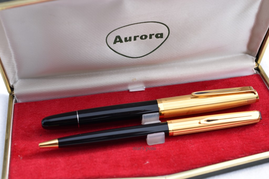
My 98 happens to be a sterling silver model in a set with a ballpoint. It was a corporate gift for someone working at Alitalia–the largest airline in Italy. I think that’s pretty cool. The deep blue velvet clam shell box is housed in a pinstriped cardboard outer sleeve.
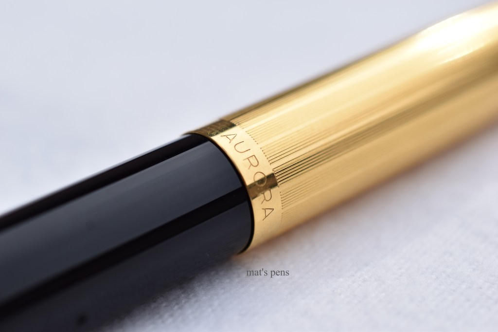
End of the cardboard outer sleeve.Certificate indicating that the pen is 92.5% Silver with a 14k nib.I wish my company gifted like this.Fountain pen with ballpoint.Sterling hallmark. Here you can see the clip; it’s the same overall shape and design as the clip introduced on the 88K, a full ten years prior. The size is different and the cut-out is not painted black, though.The round cap finial from earlier models was replaced by this style of finial. The Aurora logo and the nib grade on the reverse are the only engravings for this pen. Also note the small ink window.The piston turning knob must be pushed to extend, like clicking the back of a ballpoint pen. Here it is unextended.Here is the piston knob extended for use.
I love the 98. I think the design is clever and the pen is slick. It’s a nice size–not too fat, not too heavy. The pen writes well, posts well, and feels good in the hand. Despite being made of silver, it’s only a gram heavier than the 888P. And it writes well–it’s a smooth, toothy medium that feels good. Granted, the piston design would be called a captive converter and scoffed at today, but at the time there was no such thing as a captive converter, it was just a piston filler–converters for cartridge pens were just sort of starting to take off when this pen hit the market. The pen only holds 0.9mL of ink.
But what makes this pen awesome is the influence it had on Aurora’s future pens. This pen introduced the Riserva Magica concept, which Aurora still uses. And we still see design elements from the 98 floating around in Auora’s modern lineup–the Style series comes to mind. The 98 was also a transitional piece; it bridges the gap between the thicker cigar-shaped pens of the past and the thinner pens of the 1970s. I think it’s a really interesting pen.
At some point, Aurora stopped making the Riserva Magica 98’s and was only churning out cartridge/converter 98s. There was also some overlap with another series of pen called the International, which is, as far as I can tell, a cartridge/converter 98 but made with cheaper materials. The pen I have isn’t vintage per se, it was released in the early 2000s as part of Aurora’s Archivi Storici series–the story goes that Aurora found some new-old-stock parts, slapped some pens together, and sold them. So this is the Archivi Storici model 016, a new/old Aurora International:
Aurora must have liked this box because they re-used it for the modern Duo Cart pens. I like this box, too, so I’m glad they did.Aurora did an exceptionally nice job with this clam shell box as well. I wish they’d make more of them.The entire pen has a brushed, matte appearance without any section engravings. The pen is, overall, shorter and skinnier than the 98, making it the skinniest of them all.Same clip design, same cap finial.Here is a flat, shiny end instead of the piston knob from before.
This is also the generation of pens in which Aurora began using the Parker standard of cartridge/converter, which would have been in the late 60s or so.
I like this pen quite a bit; it was the third Aurora I purchased and the one that got me interested in vintage Aurora pens. Unfortunately, it’s also the last retro pen that I own that is a direct descendant of the granddaddy 88. I considered discussing the Hastil, but it’s not related to the 88 in any way. Similarly, the modern 88 doesn’t truly belong here either.
What does belong in this discussion, however, is the modern rendition of the Duo Cart. It’s pretty easy to trace their lineage back to the 88.
I already talked about the 2017 release of the modern Duo Cart here. I won’t drone about the 2019 version, except to say that it kept all of the good parts of the 2017 version but fixed the bad parts. It’s a solid, modern day pen.
Far right. I specifically chose the black modern Duo Cart because of how similar it looks to actual vintage Auroras.Yes, the nib is steel and not 14k gold. But it’s a champion.
There are few more models floating around that probably belong on this list that I’ve overlooked, as well as a few that I’m aware of that are worth mentioning that I don’t have examples of. In the 1960s, Aurora replaced the (old) Duo Cart with the updated Aurora 2Cart, which gave rise to the Auretta family of school pens. Those are extremely collectable in themselves. Finally, there is a model called Per Lei (For Her) which was a line of Aurora 98s without clips, sometimes with tassels on the caps. These were ladies purse pens, and while I think they’re lovely, I just don’t have any on hand.
Asking me to identify which is my favorite is like asking me to identify which of my kids are my favorite–I love all of them. If pressed, I could limit the list to three (pens, not kids)–the 88, the 888, and the 98–but I couldn’t rank them. The 88K makes the list sometimes, too, but I think that’s just because it was a white whale for me–I had a heck of a time finding an 88K for a non-insane price to add to my collection.
I suppose the real question is “why?” Why would a young Midwestern man, who neither speaks Italian, nor has any Italian heritage, who’s never even been to Italy, be so interested in an Italian pen company?
A pen is just a stick that makes marks on a page. A free ballpoint from the bank is realistically the only writing device one would ever need. A crayon picked up from the floor of Applebee’s accomplishes the same practical task, too.
But sometimes you just have to listen to your heart. I believe Dan Smith called it “feeding your soul” in one of his videos back in the day. Aurora feeds my soul.
Anyways, that’s the story I’m sticking to.
The modern 88 must have been adopted. Oldest on the left to youngest on the right.Ballpoints. Top to bottom: 88K, 88P, 98, modern 88.
Specs:
Vintage Aurora 88
Cap:
Friction fit, postable.
There were a bunch of options out there.
Nib:
14k semi-hooded, soft fine.
17 options available. Almost all of them that survived are fine or medium.
Body:
Black celluloid body with ink window. Section and piston knob in black ebonite.
Cap: friction fit; postable. Chrome or gold plated.
Nib: Fine? I don’t know what options were available.
Body: black plastic; black ebonite section. There were a bunch of options back in the day.
Filling system: Duo Cart cartridge carrier with ink alarm, originally with Aurora Biflux cartridges. Accepts modern Platinum cartridge/converters. Around 0.5mL capacity with converter.
Filling system: Duo Cart cartridge carrier with ink alarm, originally with Aurora Biflux cartridges. Accepts modern Platinum cartridge/converters. Around 0.5mL capacity with converter.
Filling system: Duo Cart cartridge carrier with ink alarm, originally with Aurora Biflux cartridges. Accepts modern Platinum cartridge/converters. Around 0.5mL capacity with converter.
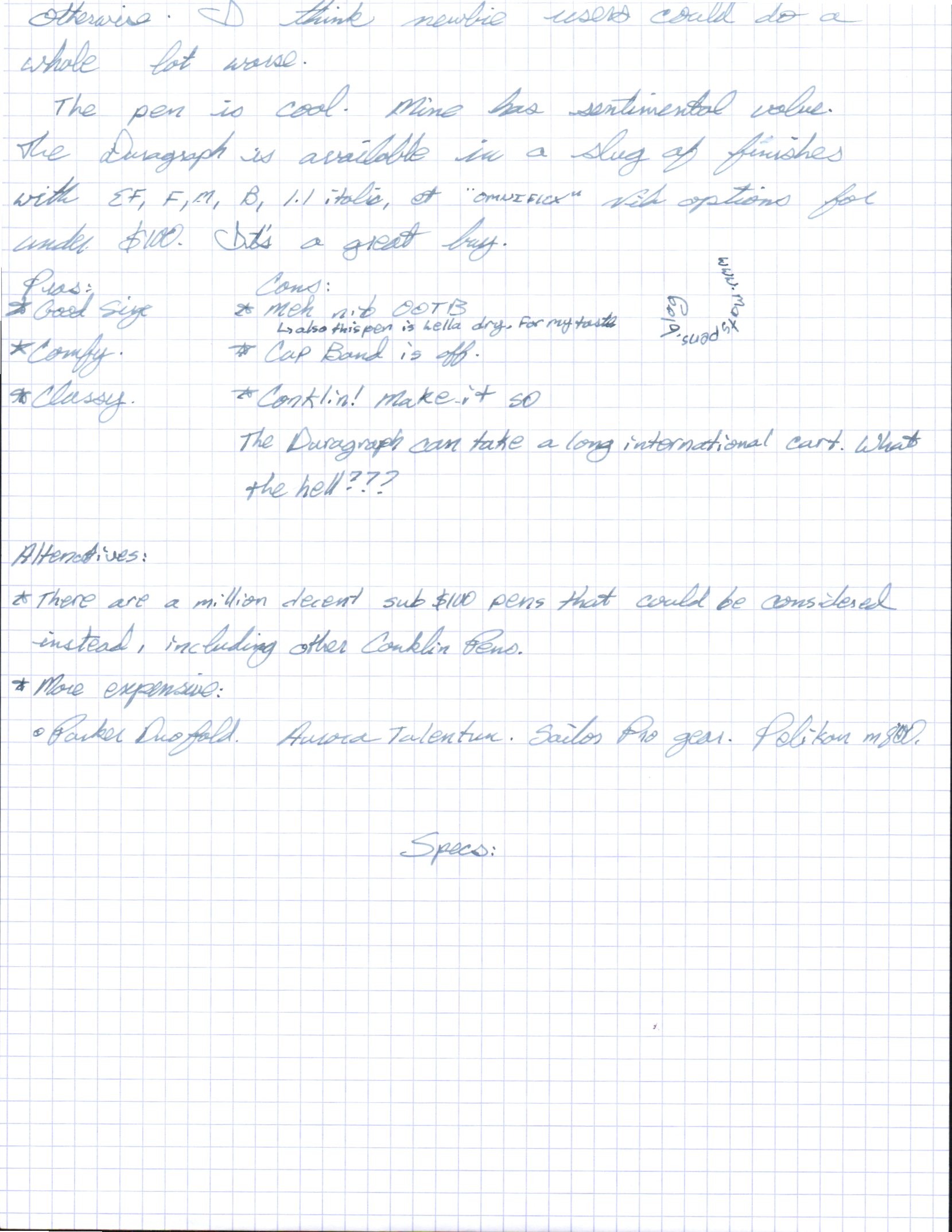
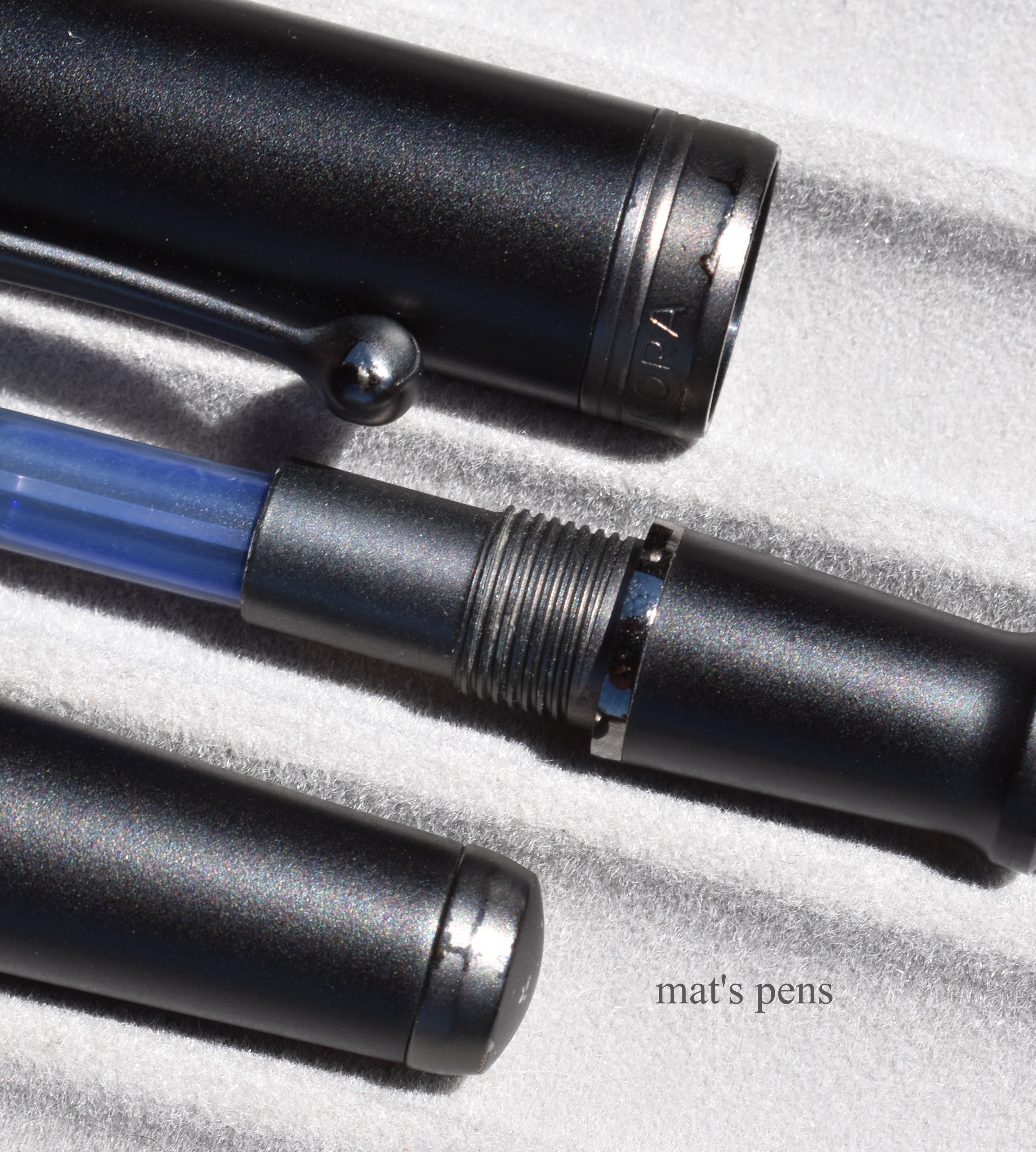
My wife bought this pen for me for Valentine’s day several years ago, so the Duragraph has sentimental value to me. I am behind the game with this pen and there isn’t a lot for me to add that hasn’t already been said about it. It’s quite popular.
First, the nib. My pen doesn’t have the original Conklin nib on it–I did consider putting it back on for the review, but ultimately decided against it. Conklin used to use Chinese nibs on their old pens, apparently switched to Bock at one time, and have since switched to JoWo. My pen was produced during the Chinese to Bock transition time, so I have no idea who made the original nib, but it wasn’t that great. I switched a spare 14k JoWo extra fine nib into the pen, and new Duragraphs should have JoWo nibs on them anyways, so it’s still a fair comparison.
I had this stock JoWo ruthenium/rhodium plated 14k gold nib in extra fine laying around. It works well on this pen.The original nib was quite attractive, it just didn’t write that well. It did write, though, so it has that going for it.Note the weird tipping geometry that lead me to switch-out the nibs. It wasn’t horrible per se, I just had a better nib handy. I like the pen more for it.
The pen has a classy, vintage-inspired feel to it. For the price, it feels well-built. The hourglass shaped section is very comfortable in use and the pen is light and balanced towards the nib, so it’s nice for longer writing sessions.
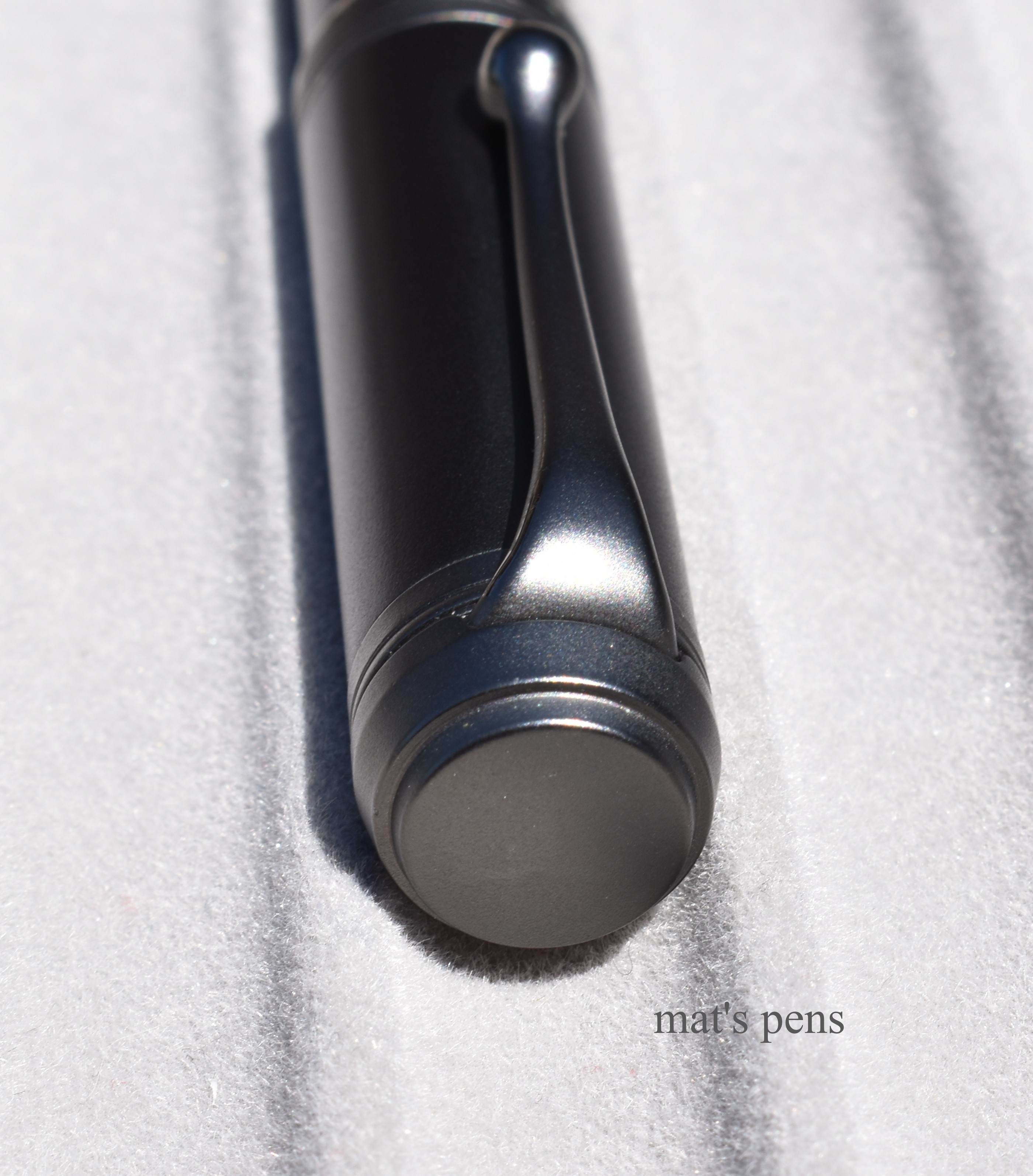
My main complaint about the pen, other than the so-so nib, is the cap band is crooked or not installed correctly. It bugs me, but is only a minor aesthetic issue.
I always like the crescent moon engravings, but note how the cap band is not aligned with the acrylic cap correctly.
The cap technically posts, but it does not do so deeply and the cap weighs as much as the pen, so posting it makes it very long, cumbersome, and back-heavy. Thankfully the Duragraph is long enough to be used comfortably while unposted.
This model is kind of cool, sentimental value aside. It’s available in a bunch of different finishes with a nice nib lineup and is attractively priced. It is a good choice for those new to fountain pens, intermediate users, or anyone who likes the way it looks.
Pros:
Nice size.
Comfortable to hold.
Classy.
Cons:
The nib was not so hot out of the box–functional, just not great.
The cap band is off on mine.
Why the hell can’t this pen accept long standard international cartridges? Huge fumble on Conklin’s part. (I mean, they fit, but they get stuck in the barrel and the user has to dig them out.)
Specs:
Cap:
Screw cap.
About 1 turn to remove.
Not exactly postable.
Nib:
Originally a stainless steel medium Conklin #6 nib of unknown origin.
This one is a #6 JoWo 14k gold nib, in extra fine.
Modern pens should have #6 Conklin branded JoWo nibs.
Currently available in extra fine, fine, medium, broad, 1.1 italic, and the proprietary Omniflex nib.
Body:
Cracked ice acrylic.
Available in a bunch of finishes.
Filling system:
Standard international cartridge/converter.
No long cartridges and don’t try to carry a short cartridge in tandem in the barrel. They feel like they’ll fit and then get stuck. It makes a hell of a mess trying to dig them out. I try these things so you don’t have to.
The pen does come with a threaded converter. Mine broke, but threaded converters are always nice.
Ink capacity for standard international converters and short cartridges is around 0.7-0.8ml.
Length:
Capped: 142mm
Uncapped: 125mm
Posted: 178mm
Weight:
Total: 24g
Pen: 12g
Cap: 12g
Section diameter:
10-11mm
Alternatives:
There are a million decent sub-$100 pens that could be considered instead, including other Conklins, but most of them don’t share the Duragraph’s vintage feel. Because of this, I tried to pick alternatives that are flat tops, similar in price, or have that “retro feel” about them. In no particular order consider:
Lamy Safari
Pilot Prera.
Some of Penbbs’s options.
Aurora Talentum, Tu, or Style.
Esterbrook Estie–it’s not a flattop, but the concept is similar.
Parker Duofold.
Jinhao Centennial. I’ve seen this one referred to (lovingly, perhaps?) as the JinhaoFold because it obviously takes some. . .inspiration. . .from the Parker Duofold.
Pelikan Souveran series. The m600 or m800 are probably closest in size and shape.
Usual bias alert: I collect Aurora pens. That Aurora logo means I’m emotionally invested at baseline, but I always challenge myself to be objective when writing about Aurora Pens.
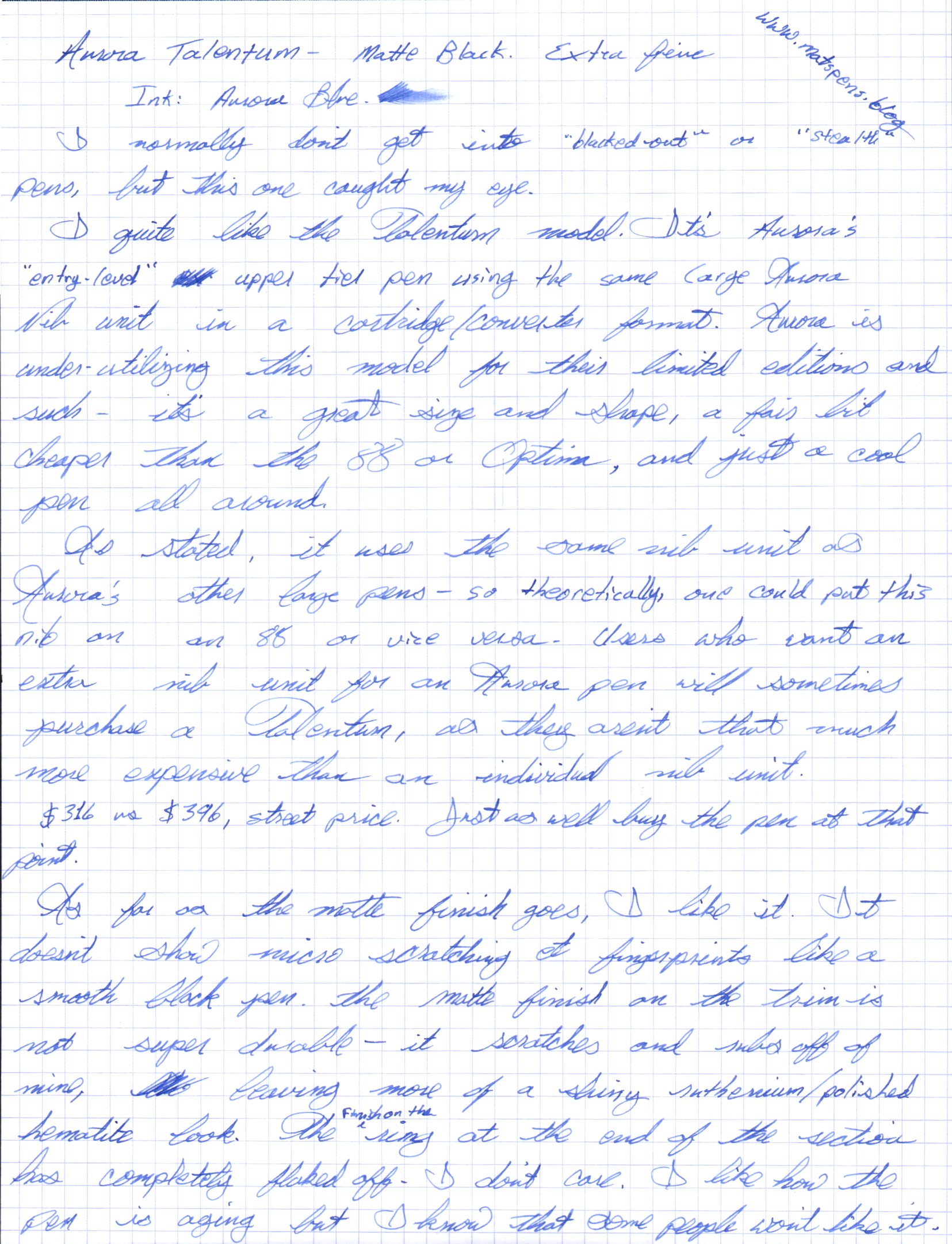
I don’t usually get into matte black pens, but this one caught my eye.
The Talentum is the “entry level” pen in Aurora’s upper tier. It uses the same nib unit as their more expensive pens but in a less expensive cartridge/converter format. Actually, it’s not uncommon for users who want an extra Aurora nib unit to just buy a Talentum as the pen is not that much more than a spare nib ($396 vs. $316 street price.)
That said, the Talentum isn’t just a cartridge/converter 88 or Optima. It’s a cool pen in its own right.
First off, the pen is a great size and shape. It’s well balanced towards the nib, and long enough to use very comfortably unposted. It posts extremely well, but becomes a bit back-heavy. I prefer to use this pen unposted, but the option to post the cap is always welcome.
The metal finial shifts the pen’s balance rearward when posted.
I like the matte resin body; it has a subtle, grippy texture and is comfortable to use for long writing sessions. The matte finish on the trim is not durable at all, however. The finish on the ring on the end of the grip section has flaked-off entirely, and in other places it’s simply scratched off under normal use. The metal underneath has a shiny ruthenium or polished hematite appearance, though, so it’s not terrible–on the contrary, I love the way this pen is aging. I do know that some people would really hate that though, so it’s important to point-out, and it sort of cheapens the feel of the pen a bit. Nit picky? Maybe.
Note the areas where the finish has worn revealing the shiny metal underneath.
Here is a proper nit-pick: I don’t like the way the inside of the cap is finished where the metal finial is connected to the end of the cap. I think Aurora could have done a better job–polished it better or covered it with a plastic inner cap or something. It doesn’t impact the writing or performance of this pen in any way. One can only see this if one is looking inside of the cap with a bright flashlight.But I noticed it, and I cannot un-notice it. There’s no way I can photograph this in a way that makes sense, but it bugs me. Maybe it is a minor qualm, but this is not a cheap pen and I have very little tolerance for tomfoolery and corner-cutting in pens this expensive.
The star of this show is the nib, however. The nib is unique with its matte finish. I’ve had no issues with the nib’s finish unlike the trim rings, and I was not able to find any examples on the internet of the nib’s finish being defective, so that’s good. This nib is an extra fine; it is rigid and precise and the ebonite feed provides a very generous ink flow. This is how I like my extra fine nibs. Mine was purchased from nibs.com and John Mottishaw tuned it a bit, so this isn’t exactly how it came out of the factory. Keep in mind that tuning and grinding a nib with any finish other than gold–not just this matte finish–will reveal the raw gold color underneath. This is how I know he ground this nib a bit before sending it. I don’t mind because this pen is a sweet writer, and it’s not like he ground a bunch of the finish off. I am just pointing it out. Nibs.com will, of course, not tune your pen, if requested.
Note the yellow gold underneath the finish where the nib was worked on. This happens with any plated nib that gets worked on.
I love the Talentum model. It is a superb choice for users who prefer its looks or prefer cartridge/converter pens. I would, however, recommend the gold or rhodium trim pens for users concerned with the matte pen’s durability.
Pros:
Sweet looking pen.
Writes really well. Aurora’s pens typically do, in my experience, but tuning by a nibmeister like John Mottishaw always helps.
Full sized and comfortable. Lovely balance. This pen is meant to write.
Cons:
The finish isn’t durable.
I recognize that most of the cost of this pen is in the nib, but this pen is still pricey for what it is.
Specs:
Cap:
Screw cap, push to post.
1.25 turns to remove.
Available in matching resin or metal caps.
Nib:
14k Large Aurora proprietary nib unit with ebonite feed, shown in extra fine.
Available in yellow gold, rhodium plated, or matte black finish.
Nib units screw-out and are interchangeable with like Aurora pens.
Commonly available nib grades are extra fine, fine, medium, and broad. Specialty nib grades include BB, Factory Stub, Factory Italic, and oblique nibs (OM, OB, OBB,) along with the Goccia EF, F, and M nibs. Not all retailers carry specialty nibs, so potential users will have to search for them (and pay extra).
I know for certain that Oblique Fine and reverse obliques (OFR, OMR, OBR, and OBBR) were available at one time, but I’ve only seen them on vintage pens from “nib testing” sets. Writers interested in those may be able to special-order them, however.
The nib grade’s availability depends on the trim. I seriously doubt one can get the more exotic nibs in the matte black finish.
Body:
Resin body. Available in matte black (shown), black, and burgundy. There is/was a yellow Talentum as well.
Filling system:
Aurora proprietary cartridge/converter.
Converter capacity is 0.8mL.
Aurora cartridge capacity is around 1.2mL.
Aurora’s system is patterned after Parker’s, so those probably work. I haven’t tested them.
Length:
Capped: 137mm
Uncapped: 133mm
Posted: 162mm
Weight:
Total: 29g
Pen: 18g
Cap: 11g
Section diameter:
10.5-12mm
Alternatives:
Aurora’s own 88 and Optima are good choices. The 88 is closer in size, the Optima is closer in shape.
Aurora Tu is also a cheaper choice from Aurora.
Pelikan m800.
Parker Duofold Centennial.
Sailor Pro Gear (especially the Imperial Black finish, if one is after the all black look.)
Conklin Duragraph or Jinhao Centennial are similar in size and shape, on the less expensive side of things.
Top to bottom: Aurora Optima, Aurora Talentum, Aurora 88, Lamy Safari.
This pen has been reviewed ad nauseam, so this is going to be short. I’m mostly doing it for the sake of completion on my end.
If you have your heart set on this pen, buy it. In my experience, Pilot’s nibs are pretty true to size, so if you want a fine, buy a fine (or whatever.) If you want a fine and buy a medium, it might be too fat.
Mine had an over polished nib out of the box and barely wrote. This is pretty strange for a Pilot. Mine was originally a medium nib; I’ve since reground a bit finer. I used my Pelikan m1000 nib as a reference, as Mike Masuyama had tuned it for me, and now my 823 writes like a million bucks. I could have taken advantage of Pilot’s excellent customer service, but I didn’t feel like it.
A few things worth mentioning: this is a hefty pen–it does have a big metal rod running through it. I think its proportions are a little strange because the pen has the length of an oversized pen, but not the girth. It’s longer than a Pelikan m1000 when capped, so pocket carry in a shirt pocket isn’t optimal. Posting the pen throws the balance in a weird way. The dimensions are just strange on this pen.
Some people do not like the ink shutoff feature, but there are videos on how to disable it. Personally, it’s not that big of deal to undo the blind cap a bit to open the valve in everyday writing, but it is a huge boon when traveling. This is one of my favorite pens to travel with because it holds a bucket of ink (2.2mL!) and is virtually leak-proof with the cutoff valve engaged.
This is about how much the cap needs to be unscrewed to open the ink valve.Ink valve open.
Overall, it’s a good pen. It didn’t blow me away, but it is a very practical piece.
Pros:
Cool filling system. Let’s be honest, most people who are going to buy this pen do it because it’s a vac filler.
Huge ink capacity. The largest capacity of any self-filling pen I own, let alone a cartridge/converter pen.
Cons:
Mine needed work out of the box. What the hell, Pilot?
It takes some finagling to make use of the pen’s entire capacity; there’s plenty of videos on how to do this. It’s not that hard, but the more fiddling it takes to fill a pen the more likely one is to have inky fingers.
It sort of has weird proportions, at least to me. Too skinny for its length, and not in “super balanced comfy desk pen” kind of way. Short, stubby section. Long and back-heavy when posted. It’s comfortable enough, I just think it could be better.
Specs:
Cap:
Screw cap, push to post.
1.75 turns to remove.
Nib:
14k gold Pilot #15.
In North America, it’s commonly available in fine, medium, and broad.
If buying from Japan, one has access to Pilot’s entire nib lineup except the music nib, as far as I can tell. Soft fine, fine medium, soft fine medium, soft medium, double broad, coarse (sort of like a 3B nib), posting, waverly, stub and falcon.
Body:
Injection molded resin.
Available in amber or smoke (shown) in North America, additionally there is clear demonstrator available in the Japanese market.
Filling system:
Vacuum filler with ink shutoff valve.
Measured total ink capacity is 2.2mL. A typical fill is a bit less than this.
Length:
Capped: 150mm
Uncapped: 131mm
Posted: 164mm
Weight:
Total: 30g
Pen: 21g
Cap: 9g
Section diameter:
10.5-11.5mm
Alternatives:
Vintage pens sometimes use the vac system, most notably Sheaffers.
TWSBI Vac 700 series pens.
Visconti pens with the “Power Filler” system.
Penbbs makes some vacuum fillers. They have several models.
Top to bottom: Pelikan m1000, Pilot Custom 823, Lamy Safari.The artifacts are from the rain I received while photographing the pen.